Custom Alert in SwiftUI
iOS SwiftUI customComponent tutorial Estimated reading time: 9 minutesRecently I have faced with design-related requirements for Alert on my project - Image should be shown with rich description and additional actions.
A quick check of the existing Alert API provided by Apple shows that there is nothing exist for showing alert to the user with custom Content either Image either TextInput… So I decided to prepare it by myself.
idea
The very first that need to be designed - it’s Buttons for an alert. Let’s grab an idea from Apple and introduce our own Button with separate building functions - one for destructive and another one for the regular type of button.
I always prefer to separate full implementation into the simplest possible components and implement all of them separately. Also, let’s keep in mind the possibility of extending any part of our component.
Now, when we already separate components into simple parts, let’s try to implement them.
implementation
So let’s start and implement this. To do so, we can define struct for this:
import Foundation
import SwiftUI

struct UniAlertButton {

    enum Variant {
        case destructive
        case regular
    }
}
And we need to add builders for buttons. Putting all together, we can have next:
struct UniAlertButton {

    enum Variant {
        case destructive
        case regular
    }

    let content: AnyView
    let action: () -> Void
    let type: Variant

    var isDestructive: Bool {
        type == .destructive
    }

    static func destructive<Content: View>(
        @ViewBuilder content: @escaping () -> Content,
        action: (() -> Void)? = nil
    ) -> UniAlertButton {
        UniAlertButton(
            content: content,
            action: action ?? { },
            type: .destructive
        )
    }

    static func regular<Content: View>(
        @ViewBuilder content: @escaping () -> Content,
        action: @escaping () -> Void
    ) -> UniAlertButton {
        UniAlertButton(
            content: content,
            action: action,
            type: .regular
        )
    }

    private init<Content: View>(
        @ViewBuilder content: @escaping () -> Content,
        action: @escaping () -> Void,
        type: Variant
    ) {
        self.content = AnyView(content())
        self.type = type
        self.action = action
    }
}
Note:
private init- this will restrict anyone to create uncategorized buttons forAlert.
Now it’s time to design Alert itself. This should be a View that can be constructed from Content and attach some buttons (UniAlertButton) that we already have.
Thus we would like to build our Alert within Content with View type, we need to define this at struct description:
struct UniAlert<Content>: View where Content: Viewnext - add input param for View to store Content and as it is done within Apple Alert - @State about visibility of Alert, and don’t forget about buttons (UniAlertButton).
import Foundation
import SwiftUI

struct UniAlert<Content>: View where Content: View {

    @Binding private (set) var isShowing: Bool

    let displayContent: Content
    let buttons: [UniAlertButton]

    var body: some View {
		displayContent
	 }
}
Now we should be able to create a convenient way of presenting Alert - using View extension modifiers:
extension View {

    func uniAlert<Content>(
        isShowing: Binding<Bool>,
        @ViewBuilder content: @escaping () -> Content,
        actions: [UniAlertButton]
    ) -> some View where Content: View {
        UniAlert(
            isShowing: isShowing,
            displayContent: content(),
            buttons: actions
        )
    }
}
And if we create some preview for testing purpose with a body like this:
struct UniAlert_Previews: PreviewProvider {

    static var previews: some View {
        NavigationView {
            Color.white
        }
        .uniAlert(
            isShowing: .constant(true),
            content: {
                VStack {
                    Text("Title")
                        .font(.system(size: 17, weight: .semibold))
                        .padding(.bottom, 8)
                    Text("Subtitle")
                        .font(.system(size: 13, weight: .regular))
                }
                .padding(.bottom, 8)
                .multilineTextAlignment(.center)
                .foregroundColor(Color.black)
            },
            actions: [
                .destructive(content: {
                    Text("Cancel")
                        .foregroundColor(Color.blue)
                        .font(.system(size: 17, weight: .regular))
                }),
                .regular(content: {
                    Text("Continue")
                        .foregroundColor(Color.blue)
                        .font(.system(size: 17, weight: .semibold))
                }, action: { })
            ])
    }
}
we can get unexpected result:
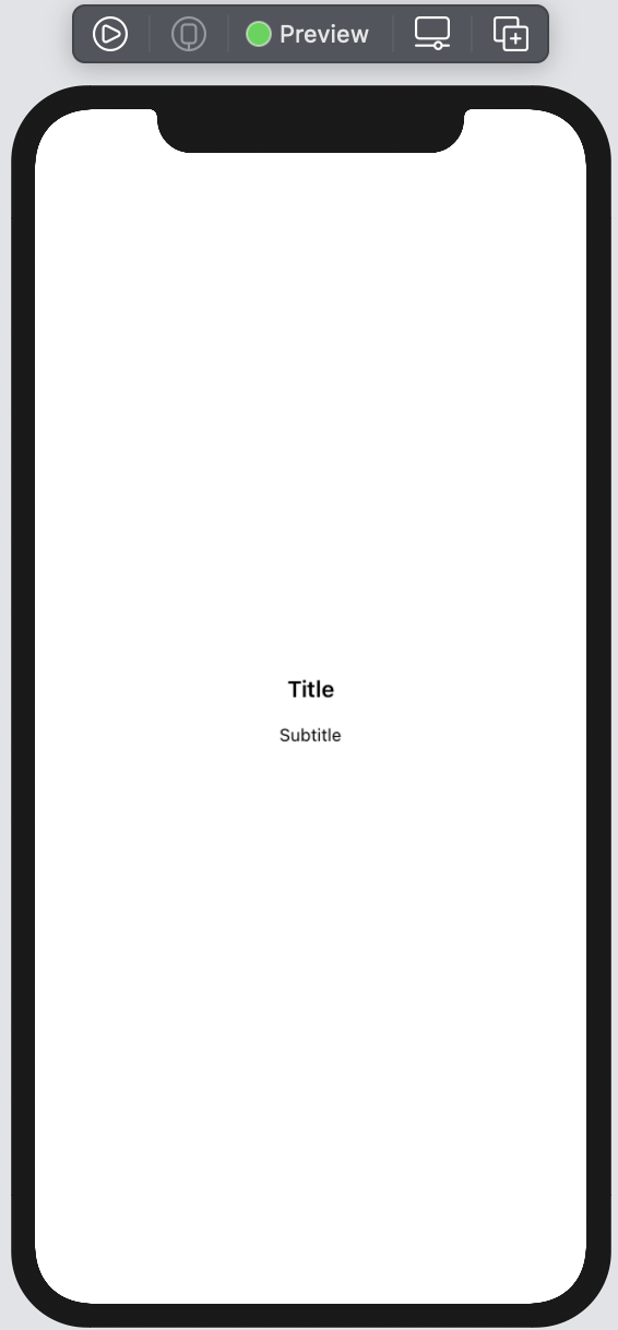
Heh, good - we know that our content can be rendered as expected. Let’s add all other components and update their position by adding GeometryReader and by calculating the positioning of all components in required places.
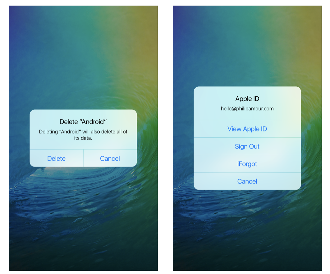
Before we proceed, let’s recap how system Alert handle 2 and 3 or more buttons:
Ok, keeping this in mind we should define different building blocks:
- determine which approach to use for buttons - position horizontally or vertically (
requireHorizontalPositioning) - determine presenting context color (
backgroundColorView) - determine builders for horizontal and vertical buttons with appropriate layouts (
verticalButtonPadandhorizontalButtonsPad)
First items is quite easy to achive - just check number of buttons and we are ready to go:
private var requireHorizontalPositioning: Bool {
    let maxButtonPositionedHorizontally = 2
    return buttons.count > maxButtonPositionedHorizontally
}
Context color also not a problem:
private func backgroundColorView() -> some View {
    backgroundColor
        .edgesIgnoringSafeArea(.all)
        .opacity(self.isShowing ? 0.8 : 0)
}
note u may vant to use
@ViewBuilderinstead like:
@ViewBuilder
var backgroundColorView: some View {
    backgroundColor
        .edgesIgnoringSafeArea(.all)
        .opacity(self.isShowing ? 0.8 : 0)
}
Ok, and last but not least - positioning of content:
Let’s start from easiet part - vertical buttons pad for case when we have 3 or more buttons:
private func verticalButtonPad() -> some View {
    VStack {
        ForEach(0..<buttons.count) {
            Divider()
                .padding([.leading, .trailing], -contentPadding)
            let current = buttons[$0]
            Button(action: {
                current.action()
                withAnimation {
                    self.isShowing.toggle()
                }
            }, label: {
                current.content.frame(height: 30)
            })
        }
    }
}
note
contentPadding- property that we will use for controlling content padding all over theAlertvar contentPadding: CGFloat = 16
We just iterate through all buttons and put them in VStack with Divider between them. And adjusting padding.
Next part - is to position horizontal buttons. In similar approach let’s iterate over buttons and put them in HStack with Divider:
private func horizontalButtonsPadFor() -> some View {
    VStack {
        Divider()
            .padding([.leading, .trailing], -contentPadding)
        HStack {
            Spacer()
            ForEach(0..<buttons.count) {
                Spacer()
                if $0 != 0 {
                    Divider().frame(height: 50)
                        .padding([.top, .bottom], -8)
                }
                let current = buttons[$0]
                Button(action: {
                    current.action()
                    withAnimation {
                        self.isShowing.toggle()
                    }
                }, label: {
                    current.content.frame(height: 30)
                        .multilineTextAlignment(.center)
                })
                .frame(height: 30)
            }
            Spacer()
        }
    }
}
We can organize auto-layout selection like:
private func buttonsPad() -> some View {
    VStack {
        if requireHorizontalPositioning {
            verticalButtonPad()
                .padding([.bottom], 12)
        } else {
            horizontalButtonsPadFor()
                .padding([.bottom], 12)
        }
    }
}
Ok, now we should combine all together in to body of the Alert:
var body: some View {
    ZStack {
        backgroundColorView()
        VStack {
            VStack {
                displayContent
            }
            .padding(contentPadding)
            buttonsPad()
        }
    }
    .edgesIgnoringSafeArea(.all)
}
And result:
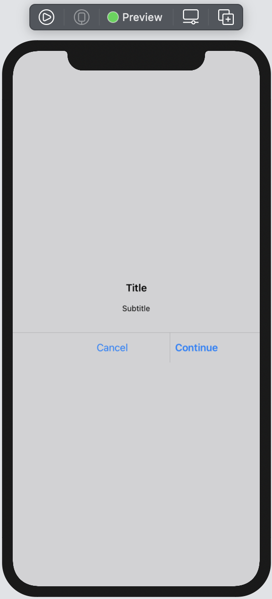
Ok, so here we can see, that content is stretched to width of View and it hasn’t any background color. We should add few more properties for Alert setup and use them in combination with GeometryReader:
// at the top of View
var backgroundColor: Color = Color.gray.opacity(0.5)
var contentBackgroundColor: Color = Color.white
var contentCornerRadius: CGFloat = 12
//...

var body: some View {
    GeometryReader { geometry in
        ZStack {
            backgroundColorView()
            let expectedWidth = geometry.size.width * 0.7
            VStack(spacing: 0) {
                VStack {
                    displayContent
                }
                .padding(contentPadding)
                buttonsPad()
            }
            .background(contentBackgroundColor)
            .cornerRadius(contentCornerRadius)
            .shadow(radius: 1)
            .frame(
                minWidth: expectedWidth,
                maxWidth: expectedWidth
            )
            .background(Color.clear)
        }
        .edgesIgnoringSafeArea(.all)
        .zIndex(Double.greatestFiniteMagnitude)
    }
}
Result:
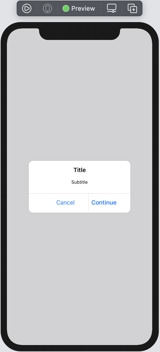
Ok, much better, but we can see some misalignment for buttons… To fix this, we need to adjust a bit the process how horizontalPad is configured. To do so - pass width of View in to building function and apply few changes:
private func horizontalButtonsPadFor(_ expectedWidth: CGFloat) -> some View {
    VStack {
        Divider()
            .padding([.leading, .trailing], -contentPadding)
        HStack {
            let sidesOffset = contentPadding * 2
            let maxHorizontalWidth = expectedWidth - sidesOffset
            Spacer()
            ForEach(0..<buttons.count) {
                Spacer()
                if $0 != 0 {
                    Divider().frame(height: 50)
                        .padding([.top, .bottom], -8)
                }
                let current = buttons[$0]
                Button(action: {
                    current.action()
                    withAnimation {
                        self.isShowing.toggle()
                    }
                }, label: {
                    current.content.frame(height: 30)
                        .multilineTextAlignment(.center)
                })
                .frame(maxWidth: maxHorizontalWidth, minHeight: 30)
            }
            Spacer()
        }
    }
}
Let’s check the result:
Looks good.
Ok,let’s apply few changes in to preview - to check appearence of our Alert:
var body: some View {
VStack {
Button(action: {
withAnimation {
isAlertWith2ButtonsShowed.toggle()
}
}, label: {
Text("Show alert")
})
}
.uniAlert(
isShowing: $isAlertWith2ButtonsShowed,
content: {
VStack {
Text("Title")
.font(.system(size: 17, weight: .semibold))
.padding(.bottom, 8)
Text("Subtitle")
.font(.system(size: 13, weight: .regular))
}
.padding(.bottom, 8)
.multilineTextAlignment(.center)
.foregroundColor(Color.black)
},
actions: [
.destructive(content: {
Text("Cancel")
.foregroundColor(Color.blue)
.font(.system(size: 17, weight: .regular))
}),
.regular(content: {
Text("Continue")
.foregroundColor(Color.blue)
.font(.system(size: 17, weight: .semibold))
}, action: { })
]
)
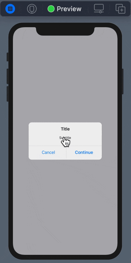
}Result is quite unexpected:
Wow! But the reason is quite simple - we need to tell explicitly what exactly the view is shown and what not. To do so - let’s add one more modification:
// add Presenter - the actual view at which we would like to apply `uniAlert`
struct UniAlert<Presenter, Content>: View where Content: View, Presenter: View
// add property to store ref to presenter
let presentationView: Presenter
// describe when to show/hide this view
var body: some View {
GeometryReader { geometry in
ZStack {
presentationView.disabled(isShowing) // <-- here
backgroundColorView()
...
// modify extension for building alert by adding new param
extension View {
func uniAlert<Content>(
isShowing: Binding<Bool>,
@ViewBuilder content: @escaping () -> Content,
actions: [UniAlertButton]
) -> some View where Content: View {
UniAlert(
isShowing: isShowing,
displayContent: content(),
buttons: actions,
presentationView: self // <--- this one
)
}
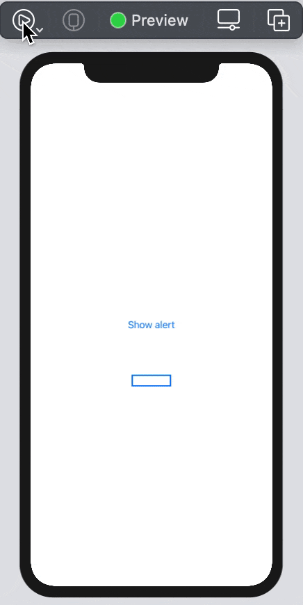
}Looks like we are done. Let’s try again:
Great! That’s exactly what we would like to have. But wait, how about 3 and more buttons? Let’s check:
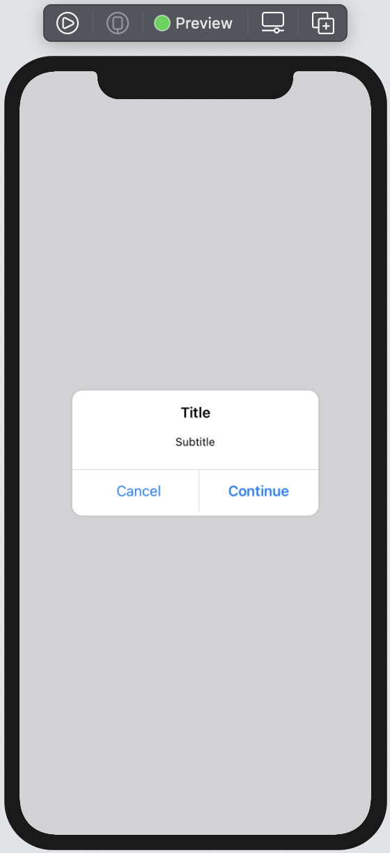
Exactly what we expect.
complete solution
The complete solution is available here
bonus
The Alert that we build is good for very simple cases. But let’s think about what we will receive if we present this alert on View that is in ZStack or on View that in TabBar or similar case?. Yes, we will not cover the whole screen, but just a part of presented view. That’s not always expected…
How to solve this?
I believe many solutions depend on a few factors. At least from the iOS supported version. I’m thinking about iOS 13+, so I ended up with combination this solution within FullScreenPresenter modifier that was covered previously and described here.
Off cause u need to modify a bit solution code like remove presenter reference (thus we use special context for Alert presentation) and modification of extension with modifier that we used to create an Alert:
extension View {

    func uniAlert<Content>(
        isShowing: Binding<Bool>,
        @ViewBuilder content: @escaping () -> Content,
        actions: [UniAlertButton]
    ) -> some View where Content: View {
        presentContentOverFullScreen(isPresented: isShowing) { appearenceFlag in
            UniAlert(
                isShowing: appearenceFlag,
                displayContent: content(),
                buttons: actions
            )
        }
    }
}
You can also think about some extension that will simplify the way how to create an alert body
enum UniAlertBuilder {

    static func makeTypicalBody(
        title: String,
        message: String
    ) -> some View {
        VStack {
            Text(title)
                .font(.system(size: 17, weight: .semibold))
                .padding(.bottom, 8)

            Text(message)
                .font(.system(size: 13, weight: .regular))
        }
        .padding(.bottom, 8)
        .multilineTextAlignment(.center)
        .foregroundColor(Color.black)
    }

    // and other ...
}
but this is just limited to you. ;]
Share on: