The styleguide
SwiftPackage Font SwiftUI iOS Estimated reading time: 7 minutesStyle - this is one of the main aspects that make u’r app looking and feeling good. U can style the same app in different ways, using different techniques, but u always use the same components - fonts, colors, and images.
Every time this can be a bit annoying process - some typos in name of the image, or searching the source image in the .xcasset catalog, managing fonts, by typing same and same name…
In this article I would like to cover how I handle this in my current project:
- Fonts
- Colors
- Images
Font
To add a custom Font in the application u should modify Info.plist file:
After adding the font file to your project, you need to let iOS know about the font. To do this, add the key “Fonts provided by application” to
Info.plist(the raw key name is UIAppFonts). Xcode creates an array value for the key; add the name of the font file as an item of the array. Be sure to include the file extension as part of the name.
Imagine, that u have one codebase for styling and few targets, a few Info.plist. In case of any change - u need to not only modify the convenient methods for this Font usage, but also all plists.
Repeating operation almost always leads to some issues… What, if we can do these only ones.
Thanks to swift package, we can easily wrap all the logic in one place. Now, we also can add resources to it (thanks to one of the latest additions). So, in theory - any font can now be shared.
Actually, it’s possible to include resources into an earlier version of SP - u can use blob data, or create separate
.bundlewith resources, as I did for one of the projects.
The last problem to solve is - how to register fonts for each target? One way is already known (add special key-value into .plist).
Another alternative can be a pre-run script that modifies Info.plist, but this way is error-prone, and I would like to avoid it.
The best way - is to use CoreText. Thanks to API from this framework, we can do font registration during app execution!
the original place, where I found this info - was an old blog post, available here
There is a few steps, that need to be done:
Step 1
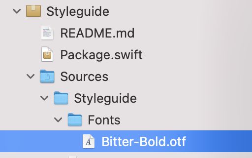
Add font to Fonts (or any name u like) directory (under a directory with the name of the SP)
Step 2
Modify the Package.swift file, to include this directory with fonts:
import PackageDescription

let package = Package(
  name: "Styleguide",
  platforms: [
    .iOS("14")
  ],
  products: [
    .library(
      name: "Styleguide",
      targets: ["Styleguide"]),
  ],
  dependencies: [
  ],
  targets: [
    .target(
      name: "Styleguide",
      dependencies: [],
      resources: [
        .process("Fonts")
      ]
    ),
    .testTarget(
      name: "StyleguideTests",
      dependencies: ["Styleguide"]),
  ]
)
the name of my package -
Styleguide
Step 3
Add code, that can allow registering the font. This is a bit tricky part - the CoreText API allows us to register concrete font, so we need to somehow know which fonts we would like to register.
The good point here is that in SP we have a bundle with resources, so we can easily lookup resource file lists and select fonts only.
To do so, we can use the next code:
Add some entity, that represents Font (we still use OOP ;])
  struct Font {
    private enum Extensions: String, CaseIterable {
      case otf
      case ttf
    }

    let name: String
    let `extension`: String

    init?(fileName: String) {
      if fileName.contains(Font.Extensions.otf.rawValue) ||
          fileName.contains(Font.Extensions.ttf.rawValue) {

        let components = fileName
          .split { $0 == "."}
          .map(String.init)

        if components.count == 2 {
          self.name = components[0]
          self.extension = components[1]
        } else {
          return nil
        }
      } else {
        return nil
      }
    }
  }
Then, using FileManager, we can search for available resources:
  private static func searchAvailableFontsInBundle() throws -> [FontConfigurator.Font] {
    if let fontFolderPath = Bundle.module.resourcePath {
      let fileManager = FileManager.default
      let files = try fileManager.contentsOfDirectory(atPath: fontFolderPath)

      let fonts = files
        .compactMap(Font.init)
      return fonts
    } else {
      throw Failure.resourcePathForBundleNil
    }
  }
And the final step - registering the font:
  static func registerFont(
    bundle: Bundle,
    font: Font
  ) throws {

    if let fontURL = bundle.url(forResource: font.name, withExtension: font.extension) {
      if let fontDataProvider = CGDataProvider(url: fontURL as CFURL) {
        if let cgfont = CGFont(fontDataProvider) {
          var error: Unmanaged<CFError>?
          let success = CTFontManagerRegisterGraphicsFont(cgfont, &error)
          if success {

          } else {
            throw FontRegistrationFailure
            .registrationFail(error?.takeUnretainedValue().localizedDescription ?? "CTFontManagerRegisterGraphicsFont failed for \(font.name)"
            )
          }
        } else {
          throw FontRegistrationFailure.creationFailed(font.name)
        }
      } else {
        throw FontRegistrationFailure.dataNotLoaded(font.name)
      }
    } else {
      throw FontRegistrationFailure.notFound(font.name)
    }
  }
u may suggest using
guardinstead ofif let, or put every unwrap check into one check using,or&&operator, but I personally like this style and separate check - this can inform the concrete problem and, as for me, a bit more visualize the flow.
This code should be called somewhere like next:
  public static func registerModuleFonts() throws {
    try searchAvailableFontsInBundle()
      .forEach {
        try registerFont(bundle: Bundle.module, font: $0)
      }
  }
Step 4
Register fonts in u’r target. This is the easiest part:
import SwiftUI
import Styleguide

@main
struct YourApp: App {

  init() {
    try? FontConfigurator.registerModuleFonts()
  }

  var body: some Scene {
    WindowGroup {
      RootView()
    }
  }
}
Benefits - 1 line of code, single source, no Info.plist modification required!
To make things, even more, better, we can wrap usage of the font into some strongly-typed config:
public enum FontName: String {
  case bitterBold = "Bitter-Bold"
}

public enum FontStyle {
  case bold
  case medium
  case regular
}

public struct FontFamily {

  let bold: FontName
  let medium: FontName
  let regular: FontName

  func fontFor(style: FontStyle) -> FontName {
    switch style {
      case .bold:
        return bold
      case .medium:
        return medium
      case .regular:
        return regular
    }
  }
}

extension FontFamily {
  static let bitter = FontFamily(
    bold: FontName.bitterBold,
    medium: FontName.bitterBold,
    regular: FontName.bitterBold
  )
}
Then, we can use specially designed ViewModifier, that wraps all work required for custom font use:
extension View {
  public func appFont(
    family: FontFamily,
    style: FontStyle = .regular,
    size: CGFloat,
    configure: @escaping (Font) -> Font = { $0 }
  ) -> some View {
    self
      .modifier(
        Styleguide.AppFont(
          name: family.fontFor(style: style).rawValue,
          size: size
        )
      )
  }
}

struct AppFont: ViewModifier {

  let name: String
  let size: CGFloat

  func body(content: Content) -> some View {
    content
      .font(
          .custom(name, size: size)
        )
  }
}
Colors
To handle color, we agreed to use a single pallet of colors, and reuse them all across the app.
So with colors - everything is pretty simple:
enum Pallete {
  static let white: Color = .white
  static let black: Color = .black
  ...
}
I also saw a very interesting approach to handling colors in an open-source app isowords from pointfree.co:
public extension Color {

  static let adaptiveWhite = Self {
    $0.userInterfaceStyle == .dark ? Pallete.black : Pallete.white
  }

  static let adaptiveBlack = Self {
    $0.userInterfaceStyle == .dark ? Pallete.white : Pallete.black
  }
}

extension Color {
  init(dynamicProvider: @escaping (UITraitCollection) -> Color) {
    self = Self(UIColor { UIColor(dynamicProvider($0)) })
  }
}
This can be used to easily refer to color or to convert colors depending on the colorScheme of the app.
Icons
In one of the previous projects, we created a wrapper for each image we can use in the app. The main purpose was to reduce the usage of strings and so, unmanaged resources.
import Foundation
import UIKit
import SwiftUI

public struct Icon {

  public let name: String
  private let bundle: Bundle?

  // MARK: - LifeCycle

  public init(_ value: String, bundle: Bundle? = nil) {
    self.bundle = bundle
    self.name = value
  }
}

extension Icon {
  // MARK: - Icon+UIKit

  public var uiImage: UIImage? {
    let image = UIImage(named: name, in: bundle, compatibleWith: nil)
    assert(image != nil, "image are missed for specified image name")

    return image
  }
}

extension Icon {
  // MARK: - Icon+SwiftUI

  public var image: Image {
    let image = Image(name, bundle: bundle)
    return image
  }
}
And then, whenever u create a feature, just add specialized .xcassets folder or folder inside single .xcassets (as u wish) and extension to Icon:
extension Icon {

  // MARK: - Login

  enum Login {

    enum SignIn {

      static let welcome = Icon.Start.Splash.appName
      ...
    }
  }
}
As result - usage of all images will be strongly typed and easily controlled.
If u like to use a lot SFSymbols, u may also want to check this repo
Resources
Share on: