Battery indicator in flutter
UI tutorial flutter dart Estimated reading time: 7 minutesSome time ago I started to play with flutter and dart. As for me - it looks very good: language available functionality within, platforms and support for various features - looks very promising.
I trying to make some functionality, and below I just want to describe how to make a battery indicator using Flutter and Dart.
Problem
We have a device with a battery to which our app can connect and read the battery state. This information needs to be shown to the user. To do so, we may want to create some ui component, that can visualize info and any change related to it.
Solution
To achieve our target we need to split the task into separate parts:
- describe battery status and state for it
BatteryStatusTypeandBatteryStatus - divide the battery indicator into separate elements and draw each separately, combining them into one element on the last step
The elements can be as follows:

Define a state
Of course, we can start from the easiest part - BatteryStatus. The idea is to describe states and all elements needed to draw it - colors, value, etc.
I decided to define possible types of status in a structure named BatteryStatusType as follows:
enum BatteryStatusType {
  low,
  mid,
  normal,
  full
}
I guess no description is needed here.
To define actual value and rendering aspects, here is another structure that describes the actual state of the battery - BatteryStatus:
final class BatteryStatus {
  BatteryStatus({
    required this.value,
  });

  final int value;

  BatteryStatusType get type {
    switch (value) {
      case >= 0 && < 20: return BatteryStatusType.low;
      case >= 20 && < 40: return BatteryStatusType.mid;
      case >= 40 && < 90: return BatteryStatusType.normal;
      case >= 00 && <= 100: return BatteryStatusType.full;
      default: return BatteryStatusType.mid;
    }
  }

  /// more values will be added here - like colors for each step, etc
}
Making indicator
Tools
BatteryIndicator will be components that use this structure to determine the current state and to show it on screen.
Before we go to the actual design, it’s good to learn about a few elements available in a flutter:
Decoration- this class can be used to change and decorate some rect - container or other structure that defines it. We can use it for changing the background, border, and other aspects. Withing our component we need to have round corners and different background colors, so this is exactly what we need.AnimatedContainer- this version of the container (or rect if u want), that automatically animate changes in it - for example background color or element size - we can use it to apply animation to our track inside the battery indicator. One more thing - thusAnimatedContaineris a rect, we can apply anyDecorationto it.LayoutBuilder- this object can provide us parent widget’s constraints, so we can use it to determine the correct geometry for our indicator inside the battery barAnimatedSwitcher- one more handy stuff - this container allows to automatically animate change of widget. Thus our indicators are only visible when the charge is low (BatteryStatusType.low), Within this container, we receive appearance animation for free.AnimationController- this one will help us to animate our icon for low charge (blinking animation will grab more attention from user to low charge state)
That’s our tool for this component.
Drawing
As I mentioned above - all that is needed is just divide our component into small parts and draw each part separately.
Thus we have a few components - we must arrange them when they are drawn. To do so, we can use Row and Stack.
  @override
  Widget build(BuildContext context) {
    return Row(
      mainAxisSize: MainAxisSize.min,
      children: [
        _batteryTrack(context),
        _batteryKnob(context)],
    );
  }
Note: in such a way we could easily change the orientation of the battery indicator - just add some properties that define supported bat orientation and combine in different order sub-components for the indicator. Like Flutter suggests - build and use everything as a constructor.
Battery tracks are combined from 2 more parts - some background and track:
// ...
Stack(children: [
  _batteryBar(context),
  _lowBatteryAnimatedIcon()
  ],
)
Here is good to mention, that all containers and other components can be modified by using Decoration:
Widget _batteryTrack(BuildContext context) {
return Container(
  height: trackHeight,
  width: _trackWidth,
  decoration: BoxDecoration(
    borderRadius: borderRadius ?? BorderRadius.circular(trackHeight / 4),
    border: Border.all(color: borderColor, width: _trackBorderWidth),
  ),
  child: Stack(
    children: [
      _batteryBar(context),
      _lowBatteryAnimatedIcon()
      ],
  ),
);
}
The most interesting part here is a batteryBar - using AnimatedContainer we can animate its width aka charge level:
AnimatedContainer(
  duration: fillChargeDuration,
  width: (_trackWidth - _trackBorderWidth * 4) * status.value / 100,
  height: double.infinity,
  curve: fillChargeCurve,
  decoration: BoxDecoration(
    color: status.batteryColor,
  ),
),
The last part is our knob - it’s just a rect (Container), that is placed in a Row near the batteryTrack:
Container(
	width: trackHeight / 6,
	height: trackHeight / 3,
	decoration: BoxDecoration(
	  color: borderColor,
	  borderRadius: BorderRadius.horizontal(
	    right: Radius.circular(trackHeight / 18),
	  ),
	)
The full code is here
enum BatteryStatusType {
  low,
  mid,
  normal,
  full
}

final class BatteryStatus {
  BatteryStatus({
    required this.value,
    this.lowColor = Colors.red,
    this.midColor = Colors.orange,
    this.normalColor = Colors.green,
    this.fullColor = Colors.green,
  });

  final int value;
  final Color lowColor;
  final Color midColor;
  final Color normalColor;
  final Color fullColor;

  BatteryStatusType get type {
    switch (value) {
      case >= 0 && < 20: return BatteryStatusType.low;
      case >= 20 && < 40: return BatteryStatusType.mid;
      case >= 40 && < 90: return BatteryStatusType.normal;
      case >= 00 && <= 100: return BatteryStatusType.full;
      default: return BatteryStatusType.mid;
    }
  }

  Color get batteryColor {
    switch (type) {
      case BatteryStatusType.low:
        return lowColor;
      case BatteryStatusType.mid:
        return midColor;
      case BatteryStatusType.normal:
        return normalColor;
      case BatteryStatusType.full:
        return fullColor;
    }
  }
}

final class BatteryIndicator extends StatelessWidget {
  const BatteryIndicator({
    super.key,
    required this.status,
    this.lowBatteryAnimatedIcon = Icons.priority_high_sharp,
    this.showIconOnWarnCharge = true,
    this.fillChargeDuration = const Duration(seconds: 1),
    this.fillChargeCurve = Curves.ease,
    this.borderColor = Colors.white,
    this.borderRadius,
    this.trackHeight = 10.0,
    this.trackAspectRatio = 2.0,
  });

  final BatteryStatus status;

  final IconData lowBatteryAnimatedIcon;
  final bool showIconOnWarnCharge;

  final Duration fillChargeDuration;
  final Curve fillChargeCurve;
  final Color borderColor;

  final BorderRadius? borderRadius;
  final double trackHeight;
  final double trackAspectRatio;

  double get _trackWidth => trackHeight * trackAspectRatio;
  double get _trackBorderWidth => trackHeight / 10;

  @override
  Widget build(BuildContext context) {
    return Row(
      mainAxisSize: MainAxisSize.min,
      children: [
        _batteryTrack(context),
        _batteryKnob(context)],
    );
  }

  // Private

  Widget _batteryTrack(BuildContext context) {
    return Container(
      height: trackHeight,
      width: _trackWidth,
      decoration: BoxDecoration(
        borderRadius: borderRadius ?? BorderRadius.circular(trackHeight / 4),
        border: Border.all(color: borderColor, width: _trackBorderWidth),
      ),
      child: Stack(
        children: [
          _batteryBar(context),
          _lowBatteryAnimatedIcon()
          ],
      ),
    );
  }

  Widget _batteryBar(BuildContext context) {
    return Padding(
      padding: EdgeInsets.all(_trackBorderWidth),
      child: ClipRRect(
        borderRadius: borderRadius ?? BorderRadius.circular(trackHeight / 6),
        child: Stack(
          children: [
            const SizedBox.expand(),
            AnimatedContainer(
              duration: fillChargeDuration,
              width: (_trackWidth - _trackBorderWidth * 4) * status.value / 100,
              height: double.infinity,
              curve: fillChargeCurve,
              decoration: BoxDecoration(
                color: status.batteryColor,
              ),
            ),
          ],
        ),
      ),
    );
  }

  Widget _lowBatteryAnimatedIcon() {
    return Center(
      child: LayoutBuilder(
        builder: (context, constraints) {
          return AnimatedSwitcher(
            duration: iconStyle.duration,
            switchInCurve: iconStyle.curve,
            switchOutCurve: iconStyle.curve,
            child: status.type == BatteryStatusType.low
		       ? Icon(lowBatteryAnimatedIcon,
		          size: constraints.maxHeight
		        )
             	: null,
          );
        },
      ),
    );
  }

  Widget _batteryKnob(BuildContext context) {
    return Padding(
      padding: EdgeInsets.only(left: trackHeight / 20),
      child: Container(
        width: trackHeight / 6,
        height: trackHeight / 3,
        decoration: BoxDecoration(
          color: borderColor,
          borderRadius: BorderRadius.horizontal(
            right: Radius.circular(trackHeight / 18),
          ),
        ),
      ),
    );
  }
}
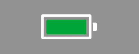
Using the code above, we can receive the next element:
Notice, that the icon is not animated, but we want to make it blinking. To achieve this, let’s build one more widget, that will make this happen. We can use FadeTransition to fade in and fade-out the icon:
  @override
  Widget build(BuildContext context) {
    return FadeTransition(
        opacity: _animationController,
        child: Icon(
          widget.style.lowBatteryAnimatedIcon,
          color: widget.style.lowBatteryAnimatedIconColor,
          size: widget.size,
          shadows: [
            const Shadow(blurRadius: 0.5),
            Shadow(
              color: widget.style.lowBatteryAnimatedIconColor,
              blurRadius: 1,
            ),
          ],
        ));
  }
The full code for element
final class BlinkingIndicatorView extends StatefulWidget {
  const BlinkingIndicatorView({required this.style, this.size, super.key});

  final BatteryAnimatedIndicatorStyle style;
  final double? size;

  @override
  BlinkingIndicatorViewState createState() => BlinkingIndicatorViewState();
}

final class BlinkingIndicatorViewState extends State<BlinkingIndicatorView>
    with SingleTickerProviderStateMixin {
  late AnimationController _animationController;

  @override
  void initState() {
    _animationController =
        AnimationController(vsync: this, duration: const Duration(seconds: 1));
    _animationController.repeat(reverse: true);
    super.initState();
  }

  @override
  Widget build(BuildContext context) {
    return FadeTransition(
        opacity: _animationController,
        child: Icon(
          widget.style.lowBatteryAnimatedIcon,
          color: widget.style.lowBatteryAnimatedIconColor,
          size: widget.size,
          shadows: [
            const Shadow(blurRadius: 0.5),
            Shadow(
              color: widget.style.lowBatteryAnimatedIconColor,
              blurRadius: 1,
            ),
          ],
        ));
  }

  @override
  void dispose() {
    _animationController.dispose();
    super.dispose();
  }
}
By replacing the Icon element with this blinking widget:
AnimatedSwitcher(
    duration: iconStyle.duration,
    switchInCurve: iconStyle.curve,
    switchOutCurve: iconStyle.curve,
    child: status.type == BatteryStatusType.low
        ? BlinkingIndicatorView(style: iconStyle, size: constraints.maxHeight) // <- instead of Icon
        : null,
  );
we can receive this:

Conclusion
Always inspect available functionality in API - u will wonder, how many times the things that u want to create are already prepared for u.
Resources
Share on: