Custom Slider with SwiftUI
iOS SwiftUI tutorial customComponent Estimated reading time: 5 minutesCustom components are independent pieces of functionality that can be reused in your code. In this tutorial we will make custom Slider.
intro
Sooner or later, each of us can face with the needs to create our own UI component. So in this post I want to describe how to create custom Slider component.
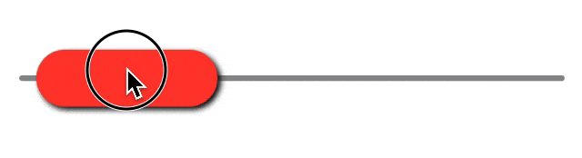
Well let’s look at result first:
structure
I always start from making complex thing a bit easier. And then repeat this operation on received part until all parts become very simple and easy to understand. So, here let’s do same way.
for me also one of the best approach — is to grab something simple or/and check existing similar custom component — to get understanding of upcoming work (just to find an idea how it works). Combining received information with API documentation u, in theory, can do anything u like.
When I checked design first I analyze what should be done, which parts can be customized and so on. Looking at this slider I can see at least few basic components (offcause u may see even more - all depends only from customization level that is required):
- track (and params)
- thumb (thumb and params)
under params we may assume at minimum next:
- color
- shadow
- active/inacitve state
So, looks like all components is quite simple, so let’s try to put them all together.
Let’s call this component FatSlider :].
implementation
We can start by defining simple structure:
struct FatSlider: View {

    var body: some View {
        GeometryReader { geometry in
            VStack {
                Spacer()
                ZStack {
                    // here will be our content
                }
                Spacer()
            }
        }
    }
}
So we defined few components here:
GeomentryReader- required to correctly adjust position and resize subcomponents of sliderVStackandSpacer- to vertically organize all slider components in stack and make sure that our slider will be positioned in center (this part can be removed later, when we define geometry of our component, for now it’s just help us center all the content)ZStack- this is container where we will positiontrackandthumbone on each other
Let’s add content inside. We can think about content as some simple drawing like Rectangle. But in my case I used Capsule, because the side a bit rounded.
api - A capsule shape is equivalent to a rounded rectangle where the corner radius is chosen as half the length of the rectangle’s smallest edge.
So let’s use 2 Capsule - one for track and one for thumb (i believe u can use Rectangle if u like and add cornerRadius as parameter).
Adding 2 capsule gives us nothing, so we also need to use GeomentryReader to figure-out correct position of each capsule.
To do so we should think about track and thumb thickness.
var thikness: CGFloat = 4and to calculate position of thumb we need to define one more property - percentage, this one should be @State - because we would like to store this value over view updates
@Binding var percentage: FloatAlso few moments that need to be done - this is size of components and position of components:
- track:
- size - .init(width: bounds.size.width, height: thickness)
- position - center of view
- thumb:
- size - .init(width: bounds.size.width / 3, height: thickness x 10)
- position - left origin + size.width / 2 (controllable by
percentage). Here also a bit tricky moment - we sould limit position of thumb by it’s size.

So far so good - keeping this all in mind, let’s transform the idea in the code:
// start of struct
ZStack {
    let centerYPoint = geometry.size.height / 2

    Capsule()
        .frame(height: thikness)
        .position(
            x: geometry.size.width / 2,
            y: centerYPoint
        )

    let heightOfPicker: CGFloat = thikness * 10
    let widthOfPicker: CGFloat = geometry.size.width / 3
    let currentXPositionOfPicker: CGFloat =
        geometry.size.width * CGFloat(percentage)
    let normalizedPosX = min(
        geometry.size.width - widthOfPicker / 2,
        max(widthOfPicker / 2, currentXPositionOfPicker)
    )

    Capsule()
        .frame(width: widthOfPicker, height: heightOfPicker)
        .position(
            x: normalizedPosX,
            y: centerYPoint
        )
}
note: on this point we can remove
VStackandSpacer
Preview show for us next:
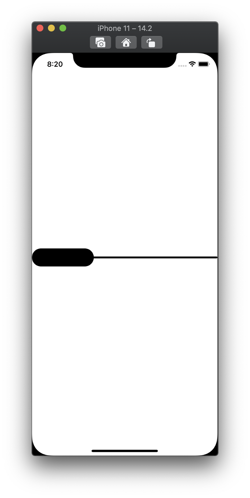
add
.frame(height: 44)toPreviewProvider, in other case u will get full screen slider :]Not bad ;].
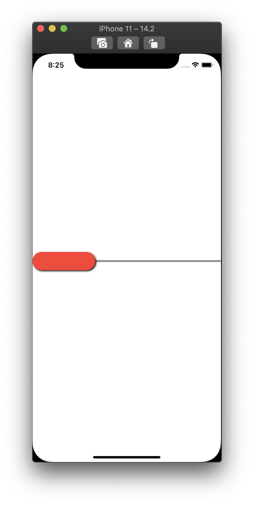
Let’s add some decoration to these shapes. As was mention above I’m going to change only few aspects of the slider, so let’s add appropriate properties for them:
var backgroundTint: Color = .gray
var pickerTint: Color = .red
var pickerShadowColor: Color = .black
and apply them to slider:
// start of struct
ZStack {
    let centerYPoint = geometry.size.height / 2

    Capsule()
        .foregroundColor(backgroundTint)
        .frame(height: thikness)
        .position(
            x: geometry.size.width / 2,
            y: centerYPoint
        )
    // calculation
    Capsule()
        .foregroundColor(pickerTint)
        .frame(width: widthOfPicker, height: heightOfPicker)
        .position(
            x: normalizedPosX,
            y: centerYPoint
        )
        .shadow(
            color: pickerShadowColor,
            radius: 2.0,
            x: 2,
            y: 2
        )
}
...
Asking preview for result:
Ok, style looks fine, but how about interaction? To bring some life into our slider we gonna use Gesture (we will apply it to the thumb, thus only this part should be movable):
// exactly after defining shadow for thumb add this code
.gesture(
	DragGesture(minimumDistance: 0)
	.onChanged({ (value) in
	    let activeWidth = geometry.size.width - widthOfPicker
	    // calculate point including thumb size limits
	    let pointX =
	        min(
	            geometry.size.width - widthOfPicker,
	            max(0, value.location.x - widthOfPicker / 2)
	        )
	    percentage = Float(pointX / activeWidth)	})
)
And that’s it - remember we used percentage when define current position of thumb.
Great, basic functionality is done. You can add any additional feature to component if u like, for example if u want to make sticky version of slider (the one that can return to initial position after release) u just need to add a few lines of code:
To do so
// add at the top of file
// define prop whenever this functionality required
var isSticky: Bool = true

//add one event handler for gesture
.onEnded({ (value) in
    if isSticky {
        withAnimation {
            percentage = 0
        }
    }
})
Full solution code
Share on: