Old new friends - Part 1: Buttons, Menus, Pickers
iOS Style Estimated reading time: 5 minutesEach application has its style, its character. This style reflects the purpose and functionality provided by it.
With SwiftUI, we, as developers, receive a unified option to write once and get all. Off cause, this is not easy to implement, and so SwiftUI is a bit raw in some aspects, but in general, the way how this framework reduces the amount of work is impressive.
Thinking about the scope of the application, SwiftUI still should help to develop the unique style. To achieve this, SwiftUI proposes for us styles - build-in modifiers, that can change the way, how UI components look and feels.
Intro
To work efficiently u should know u’r tools, so investigating and knowing the available styles (and other out-of-the-box functionality) is one of the main goals for us.
For quick and dirty start we can just create a sample project and start typing .style as a modificator. The result - u will see a bunch of the styles, that can be used:
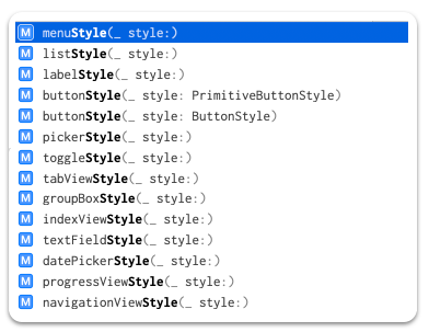
As a next step, we can go to the API doc and look at all of them a bit closer. The amount of available styles is huge:
- buttons
- menus
- pickers
- datePickers
- textFields
- toggles
- lists
- navigationViews
- tabViews
- labels
- progressViews
- indexViews
- groupBoxes
- gauges
- windows
- windowToolbars
and a small bonus - “Sign in with Apple Button” style.
Long story short - let’s check and test them all. Also, if possible we can try to create our custom style for each represented group.
Related articles:
- Old new friends - Part 1: Buttons, Menus, Pick
- Old new friends - Part 2: DatePickers, TextFields, Toggles
Buttons
The purpose of the button is pretty clear - everyone who uses a smartphone knows this component and uses it 100 times a day.
Build-In
The standard styles for button contain a lot of the types, they are the next:
- protocol
ButtonStyle- standard button interaction behavior defined for each platform and a custom appearance -
protocol
PrimitiveButtonStyle- custom interaction behavior and a custom appearance. This variant also allows us to control when totriggerthe action or not. - struct
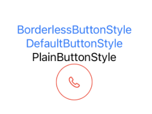
BorderlessButtonStyle:PrimitiveButtonStyle- style that doesn’t apply a border - struct
DefaultButtonStyle:PrimitiveButtonStyle- depends from platform and context - struct
PlainButtonStyle:PrimitiveButtonStyle- simple button that show effect when in non default state
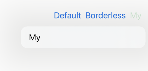
Custom
To create a custom one we should conform to one of the 2 protocols listed above (depending on our needs) and realize makeBody:
public struct FilledCircleEffectButtonStyle: ButtonStyle {
  @Environment(\.isEnabled) private var isEnabled: Bool

  public init() {}

  public func makeBody(configuration: Configuration) -> some View {
    configuration.label
      .frame(width: 54, height: 54)
      .animation(.none)
      .foregroundColor(
        configuration.isPressed
          ? Color.blue
          : Color.red
      )
      .background(
        Circle()
          .strokeBorder(
            isEnabled
              ? (configuration.isPressed
                  ? Color.blue
                  : Color.red)
              : Color.gray,
            lineWidth: 1
          )
          .animation(.none)
          .background(
            Circle()
              .foregroundColor(Color.white)
          )
      )
      .scaleEffect(configuration.isPressed ? 0.98 : 1)
      .opacity(configuration.isPressed ? 0.9 : 1)
      .animation(.linear)
  }
}
interesting moment - how to detect disabled state (used
Environment), for pressed - used standard propertyconfiguration.isPressed
Test
The result is next:
Menus
From the name, we can deduce that MenuStyle was created to modify the appearance and behavior of the menus.
Menus were created especially for creating some context around a set of buttons.
Build-In
Thus menu works with buttons, the styles for the menu are similar to one that exists for buttons:
-
protocol
MenuStyle- standard interaction behavior and a custom appearance - struct
DefaultMenuStyle:MenuStyle- default menu style can vary by platform. By default, macOS uses the bordered button style - struct
BorderlessButtonMenuStyle:MenuStyle- a borderless button that toggles the display of the menu’s contents when pressed. - struct
BorderedButtonMenuStyle- a bordered button that toggles the display of the menu’s contents when pressed. (macOS only)
Custom
The customization process for this style can be done in the same way as for buttons:
struct MyMenuStyle: MenuStyle {
  func makeBody(configuration: Configuration) -> some View {
    Menu(configuration)
      .foregroundColor(.green)
  }
}
Test
The result is next:
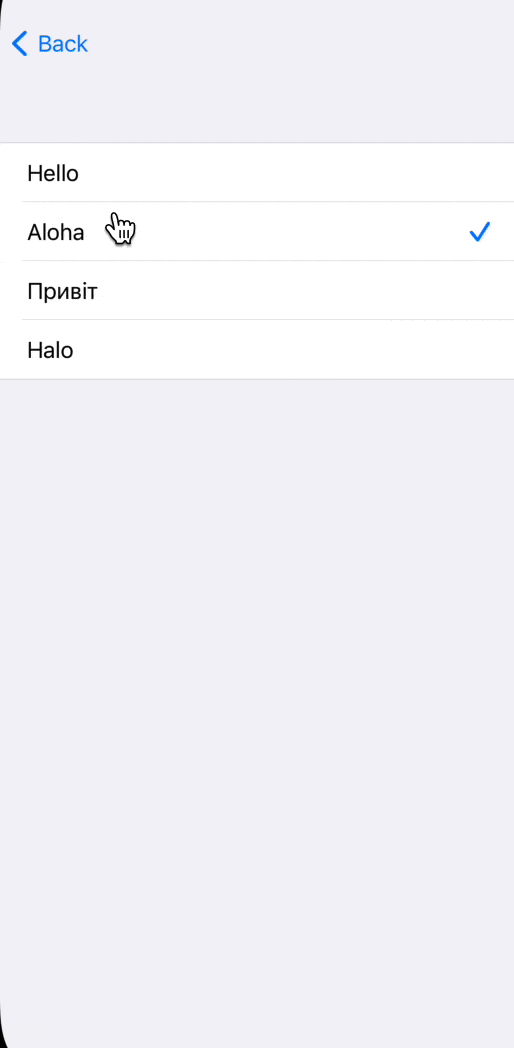
Pickers
This control allows us to select something from the given options. We can style this control in many ways -
Build-In
The types are next:
-
protocol
PickerStyle- appearance and interaction of all pickers within a view hierarchy - struct
DefaultPickerStyle:PickerStyle- show picker in a default manner for selected platform - struct
InlinePickerStyle:PickerStyle- each option is displayed inline with other views in the current container - struct
MenuPickerStyle:PickerStyle- a style that presents the options as a menu when the user presses a button, or as a submenu when nested within a larger menu - struct
SegmentedPickerStyle:PickerStyle- segmented control - struct
WheelPickerStyle:PickerStyle- scrollable wheel (watch OS, iOS) RadioGroupPickerStyle- macOS onlyPopUpButtonPickerStyle- macOS only, deprecated
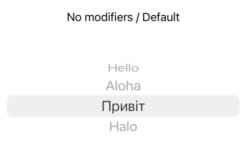
It’s important to understand the difference between these styles:
- No modifiers /
DefaultPickerStyle
SegmentedPickerStyle
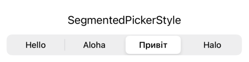
InlinePickerStyle
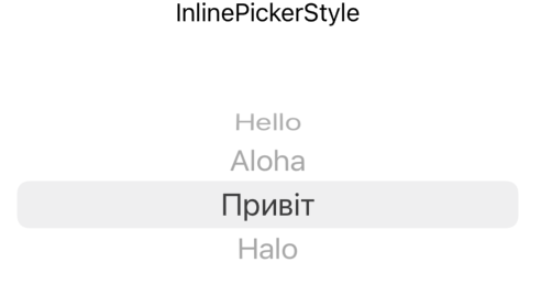
MenuPickerStyle
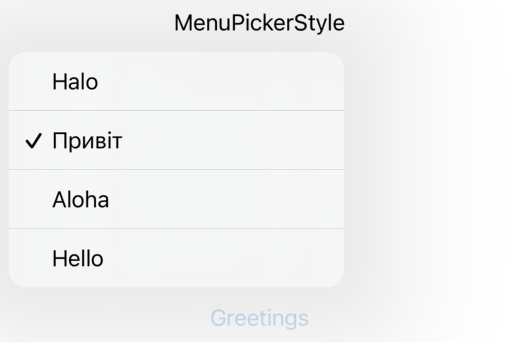
WheelPickerStyle
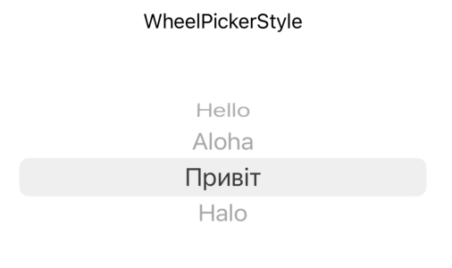
I showed a difference from the iOS perspective, so some styles look the same. But on other OS it will be different - for example, check
WheelPickerStyleon watchOS.
Also, it’s good to mention, that Picker can change if it can be embedded into Form inside NavigationView:
NavigationView {
  Form {
    initialPicker
  }
}
Custom
These types are great, but in the real world we often (or always?) should modify the appearance and style of the pickers. To do so, we can create our style.
public struct MyPickerStyle: PickerStyle {
  public static func _makeView<SelectionValue>(
    value: _GraphValue<_PickerValue<MyPicker, SelectionValue>>, inputs: _ViewInputs
  ) -> _ViewOutputs where SelectionValue : Hashable {

  }

  public static func _makeViewList<SelectionValue>(
    value: _GraphValue<_PickerValue<MyPicker, SelectionValue>>, inputs: _ViewListInputs
  ) -> _ViewListOutputs where SelectionValue : Hashable {

  }
}
As u can see here, there is a bunch of the private types that start from the underscore, so the implementation is not available (yet?) (unless u would like to invest a bit of time and play with sources or reverse engineering).
If u wondering how to make a custom Picker, take a look for additional sources, like this one
Related articles:
- Old new friends - Part 1: Buttons, Menus, Pick
- Old new friends - Part 2: DatePickers, TextFields, Toggles
Resources
Share on: