Old new friends - Part 2: DatePickers, TextFields, Toggles
iOS Style Estimated reading time: 6 minutesIn one of the previous article, I started overview of different styles that is available within SwiftUI.
This time, I will cover few more items from the list.
Related articles:
- Old new friends - Part 1: Buttons, Menus, Pickers
- Old new friends - Part 2: DatePickers, TextFields, Toggles
DetePickers
This component was specially created to allow easy pick of a date and time.
Styling can change the appearance of the DatePicker. For this purpose, we can use the datePickerStyle(_:) modifier.
Build-In
Build-In styles are:
- protocol
DatePickerStyle- describe appearance and interaction with component DefaultDatePickerStyle:DatePickerStyle- the default representation, same as.automaticGraphicalDatePickerStyle:DatePickerStyle- show date picker as a clockWheelDatePickerStyle:DatePickerStyle- displays each component as columns in a scrollable wheelCompactDatePickerStyle:DatePickerStyle- compact format, recommended to use when u have limited spaceFieldDatePickerStyle:DatePickerStyle- macOS only - displays the components in an editable fieldStepperFieldDatePickerStyle:DatePickerStyle- macOS only - displays the components in an editable field, with adjoining stepper that can increment/decrement the selected component
Custom
To create a custom style for DatePicker we should conform to DatePickerStyle, but, if u check the protocol, u can see, that it’s the empty one. For now, it’s closed and u can’t modify the appearance of this component using this approach.
Instead, we still can use other viewModifiers to achieve different effects:
foregroundColor- change the label of the pickerbackground- set the background of the whole pickerlabelsHidden()- hide the labelaccentColor- change the accent color of the pickercolorMultiply- to change the color of the view - be careful when using this modifier, thus all parts of the view are affectedtransformEffect- apply various effects to view - scale, rotation, translation, etc.
Some other hacks are available through UIAppearence and related stuff (such as global appearance configs), but this mostly things that are hard to control and so deal within.
This component was created mostly to improve UX related to the date picking process, and in case u need u’r own style that is out of this limitation - u should create u’r own picker.
We also can override the default body, but without access to the actual content components, we can only decorate or predefine some behavior for date picker:
public struct MyDatePickerStyle: DatePickerStyle {
  public func _body(configuration: DatePicker<Self._Label>) -> some View {
    VStack {
      Text("Hello from style")
      configuration.body
    }
  }
}
Such style simply wraps the components into additional UI elements, with such an approach we can reduce the duplicated code or decorate slightly a picker.
Test
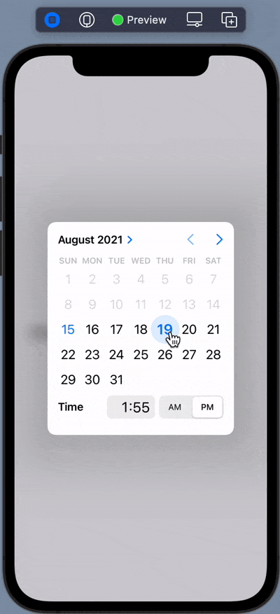
The all styles for iOS displayed in one screen:
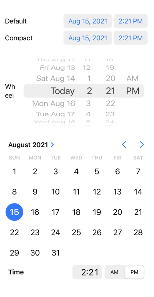
Interaction:
As usual, I won’t post screenshots from other Apple platforms (macOS, watchOS, tvOs..)
TextFields
TextFields or inputs used to collect various info from the user. We use them everywhere - from onboarding flow where users log in or register to various flows inside the app (to collect some data or to get other inputs).
Build-In
Build-In styles are:
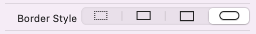
TextFieldStyle- to control appearance and interactionDefaultTextFieldStyle:TextFieldStyle- default text field stylePlainTextFieldStyle:TextFieldStyle- style with no decorationRoundedBorderTextFieldStyle:TextFieldStyle- style with a system-defined rounded borderSquareBorderTextFieldStyle:TextFieldStyle- style with a system-defined square border (macOS)
So, if u used UIKit before, u can see, that this is very similar to styles available in interface builder:
Modification of the textField style can be done within
textFieldStyle(_:)modificator.
Custom
Again, as and with DatePicker we haven’t much control over the actual components used for this UI element. Instead, we can use modifiers and create our custom wrapper/decorator for this element.
For example, if u need textField with image, we can do next:
public struct ImageTextFieldStyle: TextFieldStyle {
  public let image: Image

  public init(image: Image) {
    self.image = image
  }

  public func _body(configuration: TextField<Self._Label>) -> some View {
    HStack {
      image
      configuration
    }
  }
}
Often, we want to control different corners of textField and make it round separately. Using the same approach as above, we can achieve this using the next code:
public struct RoundedTextFieldStyle: TextFieldStyle {

  public init(
    topLeft: CGFloat = 0.0,
    topRight: CGFloat = 0.0,
    bottomLeft: CGFloat = 0.0,
    bottomRight: CGFloat = 0.0,
    fillColor: Color = .white,
    verticalPadding: CGFloat = 0.0
  ) {
    self.corners = .init(
      topLeft: topLeft,
      topRight: topRight,
      bottomLeft: bottomLeft,
      bottomRight: bottomRight
    )
    self.fillColor = fillColor
    self.verticalPadding = verticalPadding
  }

  public init(
    cornerRadius: CGFloat,
    fillColor: Color = .white,
    verticalPadding: CGFloat = 0.0
    ) {
    self.corners = .init(
      topLeft: cornerRadius,
      topRight: cornerRadius,
      bottomLeft: cornerRadius,
      bottomRight: cornerRadius
    )
    self.fillColor = fillColor
    self.verticalPadding = verticalPadding
  }

  private let corners: CornerRadius
  private let fillColor: Color
  private let verticalPadding: CGFloat

  public func _body(configuration: TextField<Self._Label>) -> some View {
    configuration
      .padding(.horizontal, 8)
      .padding(.vertical, verticalPadding)
      .background(
        RoundedCorners(corners: corners)
          .fill(fillColor)
      )
  }
}
CornerRadius- a struct that just store each corner info andRoundedCornersis a shape that handles logic related to rounding of each corner
Test
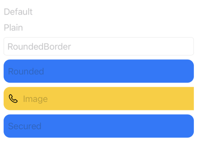
Next image demonstrate all the styles:
Toggles
A toggle is a control that represents a state for some object.
Build-In
Build-In styles are:
ToggleStyle- appearance and interaction of all togglesDefaultToggleStyle:ToggleStyle- default toggle styleButtonToggleStyle:ToggleStyle- from iOS 15, displays as a button with its label as the titleCheckboxToggleStyle:ToggleStyle- displays a checkbox followed by its label (macOS only)SwitchToggleStyle:ToggleStyle- displays a leading label and a trailing switch
Custom
Making a custom toggle is much easier - this type has already prepared a configuration that provides access to states of components.
We can conform to ToggleStyle and create our custom component:
struct SquareCheckboxToggleStyle: ToggleStyle {
  func makeBody(configuration: Self.Configuration) -> some View {
    HStack {
      configuration.label
      Spacer()
      Image(systemName: configuration.isOn ? "checkmark.square" : "square")
        .resizable()
        .frame(width: 24, height: 24)
        .foregroundColor(configuration.isOn ? .green : .black)
        .onTapGesture {
          configuration.isOn.toggle()
        }
    }
  }
}
or even better:
struct ColoredToggleStyle: ToggleStyle {
  var activeColor: Color = .orange
  var inactiveColor: Color = .black

  func makeBody(configuration: Configuration) -> some View {
    HStack {
      configuration.label
      Spacer()
      Rectangle()
        .foregroundColor(configuration.isOn ? activeColor : inactiveColor)
        .frame(width: 51, height: 31, alignment: .center)
        .overlay(
          Circle()
            .overlay(
              Image(systemName: configuration.isOn ? "checkmark" : "xmark")
                .resizable()
                .aspectRatio(contentMode: .fit)
                .font(Font.title.weight(.black))
                .frame(width: 8, height: 8, alignment: .center)
                .foregroundColor(configuration.isOn ? .orange : .gray)
            )
            .foregroundColor(.white)
            .offset(x: configuration.isOn ? 11 : -11, y: 0)
            .animation(.linear)
        )
        .cornerRadius(20)
        .onTapGesture {
          configuration.isOn.toggle()
        }
    }
  }
}
As u can see - the customization is only limited to u’r imagination ;].
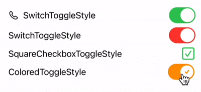
Test
The screenshot below show all possible states:
Related articles:
- Old new friends - Part 1: Buttons, Menus, Pickers
- Old new friends - Part 2: DatePickers, TextFields, Toggles
Resources
Share on: