Reusable component in Android
android view kotlin Estimated reading time: 4 minutesReuse - the biggest advance. Reuse ask us to make the stuff in a more generic, abstract way. Thanks to it, we think better, wider and we try to think about all cases (even the rare ones).
The best way to learn something - is to try. I already mentioned, that before trying something, I like to make my theory base as large as possible. This time, I want to create a view, that can be reused across all the apps - CirularProgress.
Yes, very simple component. I choose it because I don’t want to spend a lot of time on the component itself, instead - I would like to spend time on the “reuse” idea.
intro
The problem is trivial - I want to create a view, that contains some logic and can be configured and reused in the app in a few places.
My main background - is iOS, and reusing it is quite easy to do. Android, instead, has a bit more components that need to be created/managed before this option becomes available.
Before doing something, it’s good to have an idea about a few folders in android studio and components that it can hold:
- res/drawable - is a general abstraction for “something that can be drawn.” (according to official doc).
These resources can be used for a few things:
- draw images (from png, SVG, etc)
- draw XML
- draw shapes
- draw layers
- draw state
- scale
- res/values - used to store the values for the resources that are used in many Android projects including features of color, styles, dimensions, etc. In other words - XML files that contain simple values, such as strings, integers, and colors. It can hold:
- colors
- dimensions
- strings
- styles
- attributes
- etc
This is the interesting part of the current task (reusable view). But of cause its better to be familiar with other folders and their purpose (font, XML, etc).
solution
Now, when all the needed background is in place, we can start.
The very first thing that we need - is to define the layer, that can be drawed and shown to the user. To do so - we should create a new drawable resource: right click on folder » New » Drawable Resource File. Let’s name it drawable/cc_progress_bar_circular_determinative.xml (or any name u like).
I didn’t introduce saving in name length - nowadays we can use a very descriptive name at almost 0 costs.
The content of this file:
<?xml version="1.0" encoding="utf-8"?>

<layer-list xmlns:android="http://schemas.android.com/apk/res/android">

    <item android:id="@android:id/progress">
        <rotate android:fromDegrees="270"
            android:toDegrees="270">
            <shape android:shape="ring"
                android:thickness="6dp">
                <solid android:color="@color/black"/>
            </shape>
        </rotate>
    </item>

</layer-list>
layer-list allows using Z-order of objects - when they are drawn on top of another. This is often a great way to organize u’r drawing
This will draw for our progress - we grab color, use it for painting shape (ring), then rotate this shape, making the starting point of drawing at the very top.
As u can see, it’s very easy to read such XML from the inner element to the outer
Next step: create the view layout. For this purpose we should use layout folder. Let’s create a new layout with name circular_progress.xml. The content - its just a centered progress bar with our drawable source:
<?xml version="1.0" encoding="utf-8"?>

<androidx.constraintlayout.widget.ConstraintLayout xmlns:android="http://schemas.android.com/apk/res/android"
    xmlns:app="http://schemas.android.com/apk/res-auto"
    xmlns:tools="http://schemas.android.com/tools"
    android:layout_width="match_parent"
    android:layout_height="match_parent"
    android:padding="20dp">

    <ProgressBar
        android:id="@+id/circular_determinative_progress"
        android:layout_width="300dp"
        android:layout_height="300dp"
        android:indeterminateOnly="false"
        android:progressDrawable="@drawable/cc_progress_bar_circular_determinative"
        android:animationResolution = "1000"
        app:layout_constraintBottom_toBottomOf="parent"
        app:layout_constraintDimensionRatio="1:1"
        app:layout_constraintEnd_toEndOf="parent"
        app:layout_constraintStart_toStartOf="parent"
        app:layout_constraintTop_toTopOf="parent"
        tools:progress="70" />

</androidx.constraintlayout.widget.ConstraintLayout>
The one of the key moment here -
android:progressDrawable="@drawable/cc_progress_bar_circular_determinative". This attribute tells the android that it should use our drawable source.

The next step is not always mandatory, but in most cases, it is - allows to use of the custom property as an attribute for XML. To do so we should declare a custom style in /res/values/attrs.xml file (we may need to create one if it does not exist in the project, remember, this file, as mentioned above, can have multiply styles):
<?xml version="1.0" encoding="utf-8"?>
<resources>

    <declare-styleable name="CircularProgressLayout">
        <attr name="progress" format="integer"/>
    </declare-styleable>

</resources>
U can see the declared style CircularProgressLayout with the attribute progress.
And to complete the process, we must to create a component class CircularProgressLayout.kt:
class CircularProgressLayout (
    context: Context,
    attrs: AttributeSet
) : ConstraintLayout(context, attrs) {

    private lateinit var progressBar: ProgressBar
    var progress: Int
        get() { return this.progressBar.progress }
        set(value) { progressBar.progress = value }

    init {
        inflate(context, R.layout.circular_progress, this)

        val attrStyle = context.obtainStyledAttributes(
            attrs,
            R.styleable.CircularProgressLayout,
            0,
            0
        )

        progressBar = findViewById<ProgressBar>(R.id.circular_determinative_progress)

        try {
            progressBar.progress = attrStyle.getIntOrThrow(R.styleable.CircularProgressLayout_progress)
        } finally {
            attrStyle.recycle()
        }
    }
}
Then, the usage:
<com.cyber.testcustomcomponent.CircularProgressLayout
        android:id="@+id/circular_progress_view"
        android:layout_width="0dp"
        android:layout_height="0dp"
        android:clipChildren="false"
        android:clipToPadding="false"
        app:layout_constraintBottom_toBottomOf="parent"
        app:layout_constraintEnd_toEndOf="parent"
        app:layout_constraintStart_toStartOf="parent"
        app:layout_constraintTop_toTopOf="parent"
        app:progress="30">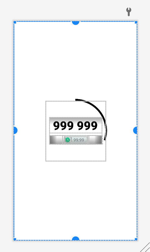
Personally, for me, I see a few downsides here, especially mutability - to change something defined in a drawable source, u need a lot of actions, also u have a layout.
To change color of progress I use this code:
    fun changeProgressColor(color: Int) {
        val drawable = ContextCompat.getDrawable(context, R.drawable.cc_progress_bar_circular_determinative)
        if (drawable != null) {
            DrawableCompat.setTint(drawable, ContextCompat.getColor(context, color))
            progressBar.progressDrawable = drawable
        }
    }
Imagine that I need to have an inactive background or round ends of the progressLine.
Of cause, we have another option - draw everything in code with bigger customizability. But this is a bit another story.
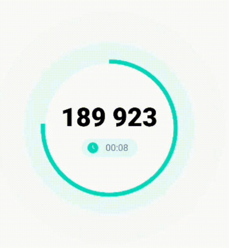
result
I did this component for use in another component - totp code generator. The final result is here:
resources
Share on: