Date Range picker in SwiftUI
iOS swift SwiftUI component Estimated reading time: 11 minutesWhen you work with various data and want to analyze or review it, you often face a problem: that certain periods of dates must be selected only. In mobile apps, this is a common functionality. Apple provided us with a great component, but, as usual, it’s not enough for many reasons.
Imagine that u may want to select some predefined period or some custom range of date (unbreaked one)… this is a tough place for standart components. In this article, let’s review how to build u’r own custom date range picker.
Design
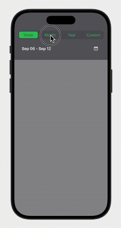
The main idea of the picker is to allow the user to select the “concept” of date picking - for example, either select week, month or year, or even a custom period. And as a second step is to provide an easy-to-use and intuitive ui for picking a selected date or a date interval.
Something like this:

Implementation
Divide and conquer
To implement this, we need to analyse it and divide the task into smaller parts. I did this as follows:
- Top segment picker (let’s name it
SegmentPicker) DatePicker- picker for date (probably standart one)
- picker for month
- picker for year
- picker for custom range
- Wrapper view that combine this all elements into hightly reusable view
So, we have a plan - it looks like we have completed our task for 50%.
grab some coffee for urself, thus half of the work is done! ;]
Top segment picker
This must be a usual segment picker. I don’t want to design and develop it only for the current purpose; instead, let’s make it very reusable. The main helpers in such things it’s ofcause protocols and generics. Luckily for us, Swift supports them both, and it’s easy to use.
We can analyse a bit our component and deside what we need from the object, which describe each picking element on the components. As for me, let’s keep it simple (we can always adjust it and add more complexity). Thus we want to select something - we definetly need some kind of identification - Identifiable is a pick number one, we also want to compare elements Equatable and thus we will use it in some collection for better usability (during ui build) we must conform our type to Hashable as well (that already conforms to Equatable. I mentioned collection here because it’s very handy to use enum for such a simple object, and with enum we can use CaseIterable for easy iteration of all objects.
To show something on the picker, we need at least a title.
So far we have:
protocol SegmentPickerElement: Hashable, Identifiable, CaseIterable {
    var id: String { get }
    var title: String? { get }
}
The good stuff in Swift is that we can add a default implementation for a protocol. Using all the above, we can do it easily:
extension SegmentPickerElement
    where Self: RawRepresentable, RawValue == String {
    var id: String {
        rawValue
    }
    var title: String? {
        rawValue.capitalized
    }
}
One more assumption - let’s assume that type is
RawRepresentable- so some associated value is already present in the type itself.
Data model for segment picker defined, the next step - draw all this stuff.
Thankfully to SwiftUI, the process of drawing is a cake - we should make HStack, iterate over all elements, for each element also draw text and anything u like:
HStack(spacing: 6) {
    ForEach(Array(T.allCases)) { segment in
        // draw it
    }
}
We also should show some selection - for example, RoundedRectangle with another color.
All this will go without some animation, but luckely for us, SwiftUI provide a mechnism known as matchedGeometryEffect.
Combining all together, we can get something like this:

Full code
protocol SegmentPickerElement: Hashable, Identifiable, CaseIterable {

    var id: String { get }
    var title: String? { get }
}

extension SegmentPickerElement
    where Self: RawRepresentable, RawValue == String {
    var id: String {
        rawValue
    }
    var title: String? {
        rawValue.capitalized
    }
}

struct SegmentPicker<T: SegmentPickerElement>: View {
    @Binding var selectedSegment: T
    @Namespace private var animationNamespace

    var body: some View {
        container
            .background(Color.secondary.opacity(0.5))
            .cornerRadius(9)
            .frame(maxWidth: .infinity)
    }

    private var container: some View {
        HStack(spacing: 6) {
            ForEach(Array(T.allCases)) { segment in
                segmentButton(segment)
                if segment != Array(T.allCases).last {
                    Divider()
                        .frame(height: 20)
                        .background(Color.black)
                }
            }
        }
        .padding(4)
        .animation(
            .interactiveSpring(
                response: 0.4,
                dampingFraction: 0.7,
                blendDuration: 0.7
            ),
            value: selectedSegment
        )
    }

    private func segmentButton(_ segment: T) -> some View {
        Text(segment.title ?? "")
            .font(.body)
            .foregroundStyle(
                isSelected(segment)
                ? Color.secondary
                : Color.green
            )
            .frame(height: 28)
            .frame(maxWidth: .infinity)
            .contentShape(Capsule())
            .background {
                if isSelected(segment) {
                    RoundedRectangle(cornerRadius: 7)
                        .fill(Color.green)
                        .matchedGeometryEffect(
                            id: "activeSegment",
                            in: animationNamespace
                        )
                }
            }
            .onTapGesture {
                withAnimation(.snappy) {
                    selectedSegment = segment
                }
            }
    }

    private func isSelected(_ segment: T) -> Bool {
        segment == selectedSegment
    }
}

enum Demo: String, SegmentPickerElement {
    case one
    case two
    case three
}

#Preview {

    StatefulPreviewWrapper(Demo.one) { value in
        SegmentPicker(
            selectedSegment: value
        )
        .padding()
    }
}
DatePicker
As u remember, we decided to divide this task into 4 types of picker - for each of the required range:
DatePicker- picker for date (probably standart one)
- picker for month
- picker for year
- picker for custom range
From here, we can deduce that our type for the segment will be next:
enum CalendarInterval: String, SegmentPickerElement {
    case week
    case month
    case year
    case custom
}
Why did I decide to divide picker by type and not create one component with all modes? Well, for simplicity reason, for better maintaiability, for better changeability - as for me, manage 4 simple components is much easier and faster in compare of “monster that can do everyting” managment. U don’t want to write a lot of
ifstatements; instead, u want to control something that can be quickly changed or even replaced.My experience tell me - “Keep it simple”. Next time, when u open u’r code, u will be gracefull.
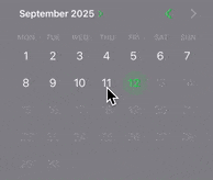
Week picker
As a week picker, we want to have a calendar view, where we can just pick a date, and the week period for this date is returned.
It’s easy to implement - we can just use standard picker and manually calculate the required period based on the picked date.
To do so, we have a very handy method from Calendar - date(byAdding:value:to:wrappingComponents:). This method is almost a solution:
extension Date {
    /// Returns 6 previous days within the current day (total - 7 days).
    func last7Days() -> [Date] {
        let calendar = Calendar.current
        let today = calendar.startOfDay(for: self)

        var days: [Date] = []

        for offset in (-6...0) {
            if let date = calendar.date(byAdding: .day, value: offset, to: today) {
                days.append(date)
            }
        }

        return days
    }
}
Month picker
Unfortunately, such of picker is not supported by default within the standard DatePicker component. But we can make a good move - use Picker prepopulated with month names.
The core idea here - generate 12 dates for each month, and using DateFormatter, get localized names of the month:
(1...maxMonth)
            .compactMap { month in
                guard let date = Calendar.current.date(from: DateComponents(month: month)) else {
                    return nil
                }
                return monthFormatter.string(from: date)
            }
After this, we have data for Picker, which can looks like a wheel thanksfully to WheelPickerStyle.
Picker("Year", selection: $data) {
    ForEach(Array(monthNames.enumerated()), id: \.offset) { index, monthName in
                Text(monthName)
          }
}
.pickerStyle(WheelPickerStyle())
Picking a month may also require picking a year. Adding another picker that uses the same approach but displays the year works just fine. Getting a year… well, we can use some hardcoded data as a dataSource for this second picker on the month range picking view:
yearRange: ClosedRange<Int> = 1900...2060
Year picker
Using approach from Month picker, we can reuse same component, by just hidding month picker. So we can combine this in one component, that have a few modes:
enum PickerMode {
    case yearOnly
    case yearAndMonth
}
Result:

Picker source code
struct DateComponentPicker: View {
    enum PickerMode {
        case yearOnly
        case yearAndMonth
    }

    @Binding var selectedDate: Date
    let mode: PickerMode
    let yearRange: ClosedRange<Int>

    private let monthFormatter: DateFormatter = {
        ValueFormatter.monthFormatter
    }()

    private var currentYear: Int {
        Calendar.current.component(.year, from: Date())
    }

    private var currentMonth: Int {
        Calendar.current.component(.month, from: Date())
    }

    private var monthNames: [String] {
        let selectedYear = Calendar.current.component(.year, from: selectedDate)
        let maxMonth = (selectedYear == currentYear) ? currentMonth : 12

        return (1...maxMonth)
            .compactMap { month in
                guard let date = Calendar.current.date(from: DateComponents(month: month)) else {
                    return nil
                }
                return monthFormatter.string(from: date)
            }
    }

    init(
        selection: Binding<Date>,
        mode: PickerMode = .yearOnly,
        yearRange: ClosedRange<Int> = 1900...2060
    ) {
        self._selectedDate = selection
        self.mode = mode

        let todayYear = Calendar.current.component(.year, from: Date())
        self.yearRange = yearRange.clamped(to: yearRange.lowerBound...todayYear)

        adjustDateIfNeeded()
    }

    var body: some View {
        HStack(spacing: 0) {
            if mode == .yearAndMonth {
                monthPicker
                    .frame(maxWidth: .infinity)
            }
            yearPicker
                .frame(maxWidth: .infinity)
        }
        .padding(.horizontal)
    }

    private var yearPicker: some View {
        Picker("Year", selection: Binding(
            get: {
                Calendar.current.component(.year, from: selectedDate)
            },
            set: {
                updateDate(year: $0)
            }
        )) {
            ForEach(yearRange, id: \.self) { year in
                Text(displayYear(year: year))
                    .tag(year)
            }
        }
        .pickerStyle(WheelPickerStyle())
        .frame(height: 350)
        .colorScheme(.dark)
    }

    private var monthPicker: some View {
        Picker("Month", selection: Binding(
            get: {
                min(Calendar.current.component(.month, from: selectedDate), currentMonthIfNeeded())
            },
            set: {
                updateDate(month: $0)
            }
        )) {
            ForEach(Array(monthNames.enumerated()), id: \.offset) { index, monthName in
                Text(monthName)
                    .tag(index + 1)
            }
        }
        .pickerStyle(WheelPickerStyle())
        .colorScheme(.dark)
        .frame(height: 350)
    }

    private func adjustDateIfNeeded() {
        let year = Calendar.current.component(.year, from: selectedDate)
        let adjustedYear = min(max(year, yearRange.lowerBound), yearRange.upperBound)

        var adjustedMonth = Calendar.current.component(.month, from: selectedDate)
        if adjustedYear == currentYear {
            adjustedMonth = min(adjustedMonth, currentMonth)
        }

        updateDate(year: adjustedYear, month: adjustedMonth)
    }

    private func updateDate(
        year: Int? = nil,
        month: Int? = nil
    ) {
        var components = Calendar.current.dateComponents(
            [
                .year,
                .month,
                .day,
                .hour,
                .minute,
                .second,
                .nanosecond,
                .timeZone
            ],
            from: selectedDate
        )

        if let year = year {
            components.year = year
        }
        if let month = month {
            components.month = month
            if let day = components.day,
               let newDate = Calendar.current.date(from: components),
               let range = Calendar.current.range(of: .day, in: .month, for: newDate) {
                components.day = min(day, range.count)
            }
        }

        if let newDate = Calendar.current.date(from: components) {
            Task {
                await MainActor.run {
                    selectedDate = newDate
                }
            }
        }
    }

    private func currentMonthIfNeeded() -> Int {
        let selectedYear = Calendar.current.component(.year, from: selectedDate)
        return selectedYear == currentYear ? currentMonth : 12
    }

    private func displayYear(year: Int) -> String {
        let formatter = NumberFormatter()
        formatter.usesGroupingSeparator = false
        return formatter.string(from: NSNumber(value: year)) ?? "\(year)"
    }
}
Custom date range picker
This is the last component we need to build. The idea here is that the user can pick the first date and the last date, and all dates in between them also become selected. If the user click one more time, all selections are gone and the clicked date become the new start date for the new range selection.
Apple indeed provides for us MultiDatePicker. The problem there is that we can pick random dates, not a range. As a solution, we may think about a custom calendar… or some workaround with a standard component.
Custom calendar is the least stuff I want to build - a lot of cases needs to be handled, a lot of work needs to be done. Better idea - is to play a bit with the standard component and make him doing what we need.
The main idea here is to manually calculate the selected period if 2 dates are selected, if 1 - do nothing, if 3 - reset the state.
All other - standard MultiDatePicker:
Result:
Wrapper view
Last step, but not least - it’s to combine all components into a single view, creating a nice wrapper view.
To simplify things a bit, we should create a way where the required data returned from the view (either one Date either Period) is easy to understand and use.
One way to achieve this is to use a custom type, let’s name it Interval:
enum Interval: Equatable {
    struct Period: Equatable {
        let start: Date
        let end: Date

        var range: [Date] {
            start.datesInBetweenTo(end)
        }
    }
    case week(Period)
    case month(Date)
    case year(Date)
    case custom(Period)
}
With this type, we can define what we expect and, at the same time, receive back well-structured data.
The result may be as follows:
The full source code available here.
Conclusion
Even doing a simple task, we can often find something new and enjoy the result.
Everything Should Be Made as Simple as Possible, But Not Simpler. (c) Albert Einstein
Resources
Share on: