Ultimate sophistication
iOS swift SwiftUI Charts Estimated reading time: 5 minutesRepresenting information in graphical mode can simplify its recognition and processing for humans dramatically. For this purpose, we have a lot of options, and one of the most popular is charts.
In mobile apps, charts are also present - the more we move forward, the more often we can see them.
Previously, if we wanted to use some charts or simple graphs, we had to draw them manually - no system components were present. Now, with SwiftUI, this can be done very easily, thanks to the Charts framework.
Let’s taste the new Charts frameworks and see what can be done within.
Before
As I mention, previosly it was a hard and long work to produce nice-controllable and efficient chart on iOS platform - using a lot of CALayers, responder chain, CAAnimation with other techniques (for example CATileLayer) can provide a nice result, but the downside of this process was always present - u need a lot of time for this.
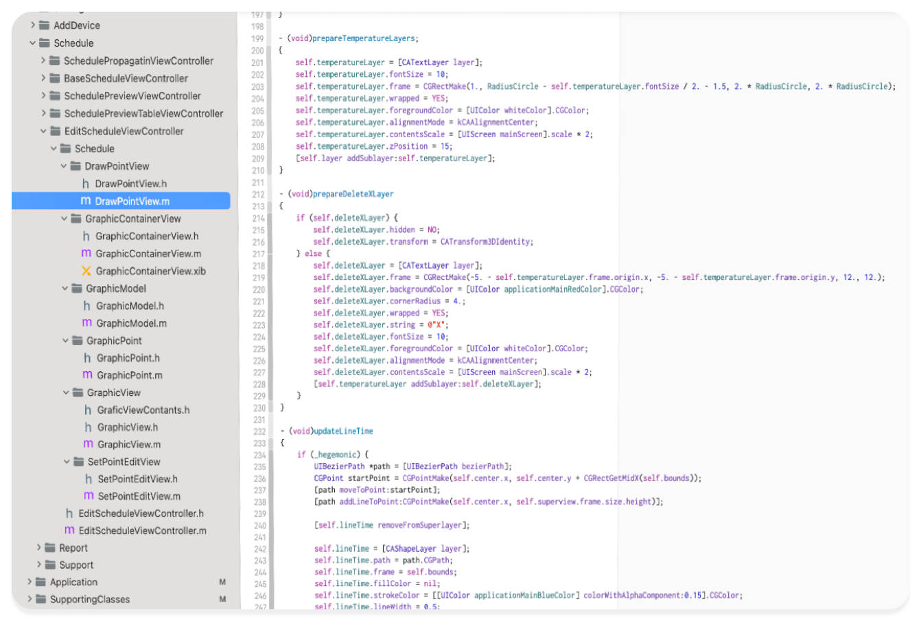
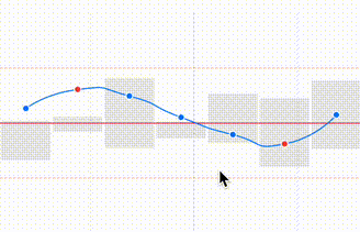
As an example, let me show u a code screenshot from a project from far 2015 - where my colleague and I developed a small chart with a schedule. Despite the chart is small, it’s supports some interactions and other components, so a lot of work needs to be done manually, and a class for moving point can easely contain a 800 lines (with a lot of reused code), a lot of aspects needs to be controller manually, for example few lines for creating shaking “x” button on top of layer with Schedule element:
Now
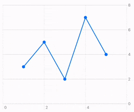
Now, with Charts, this would take, I don’t know, 30 lines of code:
Chart(dataPoints) { point in
    LineMark(
        x: .value("X-value", point.x),
        y: .value("Y-value", point.y)
    )
    .foregroundStyle(.blue)

    PointMark(
        x: .value("X-value", point.x),
        y: .value("Y-value", point.y)
    )
}
.chartOverlay { proxy in
    GeometryReader { geometry in
        Rectangle()
            .fill(Color.clear)
            .contentShape(Rectangle())
            .gesture(
                DragGesture()
                    .onChanged { value in
                        let origin = geometry[proxy.plotAreaFrame].origin
                        let location = CGPoint(
                            x: value.location.x - origin.x,
                            y: value.location.y - origin.y
                        )
                        let (x, y) = proxy.value(
	                        at: location,
	                        as: (Double, Double).self
	                        ) ?? (0, 0)
                        if let closestPoint = nearestPoint(to: (x, y)) {
                            selectedPoint = closestPoint
                            updateSelectedPointPosition(x: x, y: y)
                        }
                    }
                    .onEnded { _ in
                        selectedPoint = nil
                    }
            )
    }
}
And also, it’s very customizable. Nice.
Examples
What can be done within Charts framework?
Heh - I guess 90% of u’r needs: Bars, Lines, Pies, Plot (even a custom one! - in official example it’s a map). For doing such things before, we should did almost everything by ourselves:
- approximation of points
- drawing custom shape with
Path - managing every interaction
- updating and populating data
- even primitive animations
Yes, a lot of power (and we still can do this with SwiftUI, on purpose), but it’s nice to have an easier approach that can be used when u just need something simple.
At the moment of writing
Chart3Dis also available as beta, so even more power to this tool
For now, all the above sounds like an advertisement, but it’s probably a good work that should be known by everyone.
I play a bit more with Charts framework, and want to show u results:
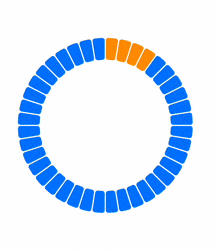
and more…
Animation
As always, we can work a bit with data and the way it can be built and combined, and add some nice small animations:
The code itself is very simple, but the effect - much better than a non-animated reload:
private func onDataChange(_ newValue: [DataModel]) {
    animationTask?.cancel()

    animationTask = Task {
        await MainActor.run {
            animatedData = []
        }

        let batchSize = 4
        var currentIndex = 0

        while currentIndex < newValue.count && !Task.isCancelled {
            let endIndex = min(currentIndex + batchSize, newValue.count)
            let batch = Array(newValue[currentIndex..<endIndex])

            try? await Task.sleep(nanoseconds: 30_000_000)

            await MainActor.run {
                withAnimation(.easeInOut(duration: 0.1)) {
                    animatedData.append(contentsOf: batch)
                }
            }

            currentIndex = endIndex
        }
    }
}
You can easily extend or change the behaviour.
Be careful - using an approach above for a HUGE amount of dataPoints will freeze a bit UI - u need to adjust the logic; this way is only good for a small data batch, up to a few hundred.
As I sad - it’s just a demonstaration, how small amount of work can improve things.
Key moments
- Be sure that your data well strucutred and u know what u have and what u want to show
- Define correctly
Domainfor u’r data forXandYscale. The correct domain can dramatically improve performance. - Use
drawingGroupfor better performance - Gestures require a bit advanced understanding of coordinate system and how to interract with it (
.global,.local, and.named(_:))..chartOverlayandGeometryReader- are the best frieds here (see example at the beginning) - If u think, that something not possible to draw with current API - think from different angle or/and introspect, analyze and implement.
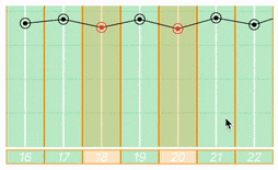
Chartshas its limitations, but usually, we can work around them. U can also combineChartswithCanvas-
similar implementation of movable points as in the example above, but with Canvas
Canvas { context, size in
    for i in 0...5 {
        let y = size.height - (CGFloat(i) * size.height / 5)
        context.stroke(
            Path { p in
                p.move(to: CGPoint(x: 0, y: y))
                p.addLine(to: CGPoint(x: size.width, y: y))
            },
            with: .color(.gray.opacity(0.2)),
            lineWidth: 1
        )
    }

    var path = Path()
    if let firstPoint = points.first {
        path.move(to: firstPoint)
        for point in points.dropFirst() {
            path.addLine(to: point)
        }
    }
    context.stroke(
        path,
        with: .color(.blue),
        lineWidth: 2
    )

    for (index, point) in points.enumerated() {
        let circlePath = Path(ellipseIn: CGRect(
            x: point.x - 10,
            y: point.y - 10,
            width: 20,
            height: 20
        ))

        context.fill(
            circlePath,
            with: .color(.blue)
        )
        context.stroke(
            circlePath,
            with: .color(.white),
            lineWidth: 2
        )
    }
}
Conclusion
It’s always interesting to check new frameworks, especially when they’re well-designed. Look and learn how to not only use a framework, but also how an API for such functionality can be organized, how different components may be combined.
“The simplicity of a chart is the ultimate sophistication.”
(c) Leonardo da Vinci.
Resources
Share on: