Visualise anything with SwiftUI Charts
iOS SwiftUI Charts Estimated reading time: 10 minutes- 1. Problem Statement
- 2. Possible Solutions Considered
- 3. Implementation Walk-Through
- 4. Pitfalls & Lessons Learned
- 5. Conclusions
- Resources
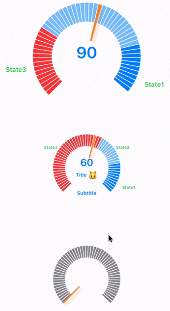
Modern health, fitness, and mindfulness apps often need to visualise progress or physiological indicators in a way that feels intuitive, animated, and informative. Apple’s SwiftUI framework—especially with the introduction of Charts—makes it possible to build expressive custom components, but assembling something more complex than a bar or line chart requires careful work.
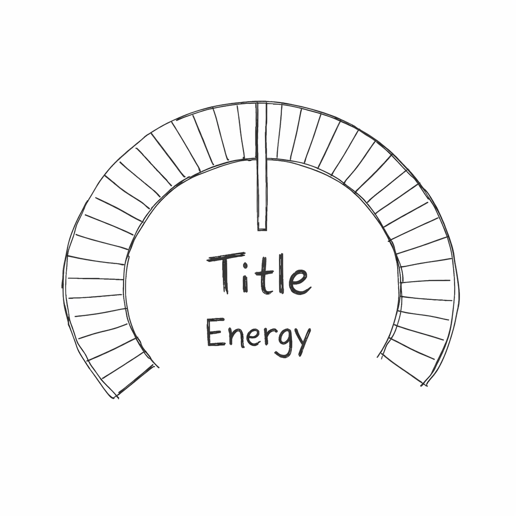
In this article, we will walk through the creation of a custom reusable SwiftUI component named StressIndicator— a radial segmented progress visualisation with section labels, animated appearance, and a dynamic indicator “pointer” showing the current value.
We’ll cover the entire journey:
- Problem Statement
- Possible Solutions Considered
- Implementation Walk-Through
- Pitfalls & Lessons Learned
- Conclusions
1. Problem Statement
We need a visualisation to express a “stress” or “energy” state as a circular gauge divided into multiple coloured sectors. Requirements include:
- A multi-segment ring, where each segment can have its own color depending on the stress type.
- Invisible “buffer” angles on each side to avoid a full 360° wrap.
- A center label and start/end labels around the circle.
- An animated trapezoid-shaped pointer that rotates to indicate stress level.
- Smooth appearance animations of the segments.
- Customisable styles for background color, indicator color, and label color.
- Support for varying stress models where ranges map to sector colours.
2. Possible Solutions Considered
Option A – Build Entirely Using Custom Shapes
- Pros: Total control over all geometry
- Cons: Harder to maintain, manual polar geometry is error-prone
Option B – Use SwiftUI Charts with SectorMark
- Pros: Simplifies continuous angle management, supports animation
- Cons: Requires creative layering and overlay alignment
Option C – Use a Canvas View
- Pros: Full drawing control
- Cons: Lose
SectorMarkconveniences, more manual work
Final Choice: Option B – SwiftUI Charts + overlays + custom Shape
3. Implementation Walk-Through
Step 1 — Defining Models
To express something we should use models. In my mind for express current stress level we should have at least 2 understanding - what Stress is (aka StressModel) and what current stress is - (aka StressValue).
For simplification let’s take a very simple stress model - a model that contains 3 value, and each value is placed on it’s own place in the chart (in it’s own zone)
enum StressType {
    case state1
    case state2
    case state3
    ...
}

struct StressModel: Hashable {
    struct LevelComponent: Hashable {
        let type: StressType
        let range: ClosedRange<Int>
    }

    let state1Range: ClosedRange<Int>
    let state2Range: ClosedRange<Int>
    let state3Range: ClosedRange<Int>

    var models: [LevelComponent] {
        [
            .init(type: .state3, range: state1Range),
            .init(type: .state2, range: state2Range),
            .init(type: .state1, range: state3Range)
        ]
    }
}
Real model can be a way more complex, but this is not important right now
Now we know what Stress is and how to handle it ;].
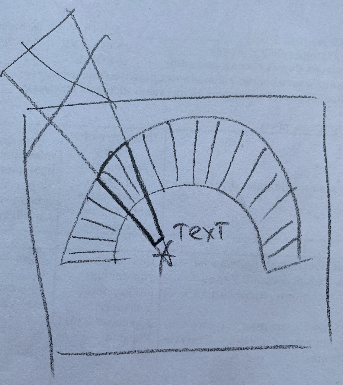
Step 2 — Creating a Custom Pointer Shape
Next step - is to create a pointer, that will point to some level of our stress - thus we have circular indicator our pointer it’s just a some kind of shape from bottom center at certain degree.
We may define this shape as rectangle, but better - if this shape be as some sector-like shape - the more from start - the wider it is. The perfect match in this case - is Trapezoid
We may define it using Shape and our old friend Path.. And thankfully to SwiftUI we also can use Animatable to make this shape animated out of the box!
I wrote an article about
Animatablehere some time ago.
private struct TrapezoidIndicator: Shape {
var progress: CGFloat
var thickness: CGFloat
var offset: CGFloat = 0.0
var outerScale: CGFloat = 1.0
var animatableData: CGFloat {
get { progress }
set { progress = newValue }
}
func path(in rect: CGRect) -> Path {
// Path calculation based on progress and geometry
}
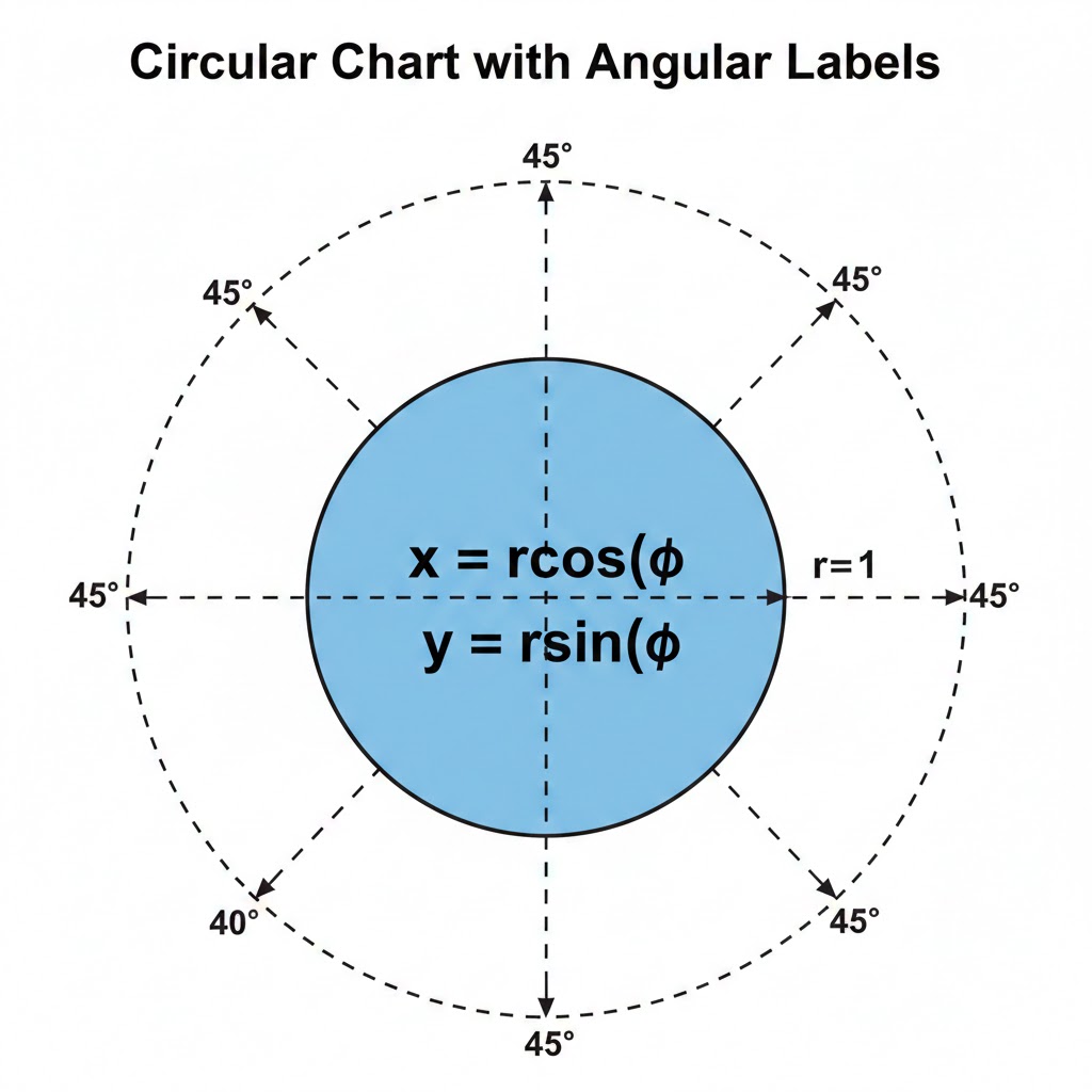
}I wont cover full math concept related to this figure and how it rotate, thus this already described by many sources, the only key here is rotation formula
θ = degreePerOnePercent × 100 × progress + angleDelta, the steps are:
Convert progress (0–1) into an angle along the visible arc.
Convert angle to a unit vector (
cosθ,sinθ) to locate tip along the circle.Define outer and inner radial points.
Compute a perpendicular vector to define trapezoid width.
Scale inner width to create a tapered trapezoid.
Connect the four points into a Path.
chatGPT helps me to draw this image from actual code, not the 8 there is just a scaling value
Full trapezoid code here
private struct TrapezoidIndicator: Shape {
    var progress: CGFloat
    var thickness: CGFloat
    var offset: CGFloat = 0.0
    var outerScale: CGFloat = 1.0

    var animatableData: CGFloat {
        get { progress }
        set { progress = newValue }
    }

    var degreePerOnePercent: Double {
        (360.0 - Double(Constants.angleDelta) * 2.0) / 100.0
    }

    func path(in rect: CGRect) -> Path {
        let center = CGPoint(x: rect.midX, y: rect.midY)
        let radius = min(rect.width, rect.height) / 2

        let angle = Angle.degrees(
            degreePerOnePercent * Double(progress) * 100.0 + Constants.angleDelta
        )

        let ax = cos(angle.radians)
        let ay = sin(angle.radians)

        let base = CGPoint(
            x: center.x + ax * radius,
            y: center.y + ay * radius
        )

        let innerBase = CGPoint(
            x: center.x + ax * radius * offset,
            y: center.y + ay * radius * offset
        )

        let perpX = -ay / 8
        let perpY = ax / 8

        let p1 = CGPoint(
            x: base.x + perpX * thickness * outerScale,
            y: base.y + perpY * thickness * outerScale
        )
        let p2 = CGPoint(
            x: base.x - perpX * thickness * outerScale,
            y: base.y - perpY * thickness * outerScale
        )

        let scale: Double = 0.1 + 0.9 * (1.0 - Double(abs(offset - 0.5)) * 2.0)
        let ip1 = CGPoint(
            x: innerBase.x + perpX * thickness * scale,
            y: innerBase.y + perpY * thickness * scale
        )
        let ip2 = CGPoint(
            x: innerBase.x - perpX * thickness * scale,
            y: innerBase.y - perpY * thickness * scale
        )

        var path = Path()
        path.move(to: ip1)
        path.addLine(to: p1)
        path.addLine(to: p2)
        path.addLine(to: ip2)
        path.closeSubpath()
        return path
    }
}
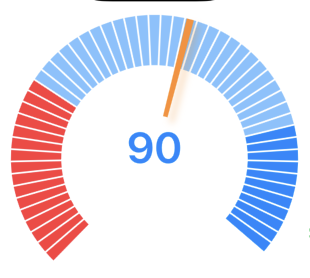
Step 3 — Constructing Sector Models
The next part is to show actuals zones. To do som we can construct sectors and highlight each sector in color that describe zone in a best way (if too stressed this of cause RED ;]).
Again, the very first step - is to define SectorModel. I ended up on one that describe it’s type, index and value (actual angle).
private struct SectorModel: Identifiable, Equatable {
    var id: Int { index }
    let index: Int
    let value: Double
    var type: StressType?

    var color: Color {
        type?.color ?? .clear
    }

    var isHidden: Bool {
        type == nil
    }
}
Thus we are playing main role in this components - it’s up to us to decide how many sectors we need, what part is visible and what is not. After playing a bit, I ended up on:
- invisible - 45 angles from the bottom (due to drawing system on iOS, we will rotate our drawing to make top at the bottom)
- q-ty of sectors - 73 (don’t ask me why - just play and select your own number - the more bigger number - the more smaller sector)
Step 4 — Mapping Stress Model → Sectors
Now the tricky part - we must somehow to connect our models: display geometry and stress.
To do so, I decided to split all circle into sections, and calculate how many sections relies to each type of stress we defined, and also which elements are visible and which not.
private var invisibleSectorDegree: Double {
    Constants.angleDelta
}

private var sectorsPerDeegree: Double {
    Double(sectorsCount) / Double(360)
}

private var invisibleSectors: Int {
    Int(sectorsPerDeegree * invisibleSectorDegree)
}

private var valueWeightPerSector: Double {
    Double(360) / Double(sectorsCount)
}


private var models: [SectorModel] {
    var result: [SectorModel] = []
    for idx in 0..<invisibleSectors {
        // Map invisible stress ranges
    }

    let visibleCount = sectorsCount - invisibleSectors * 2
    let weightOfSectorPercent = Double(visibleCount) / 100.0

    var visiblePart: [SectorModel] = []
    for level in stressModel.models {
    	    // Map visible stress ranges
	}
}
Step 5 — Building the View
And the last, the most easiest part - grab our sector models and feed it to Charts framework:
var body: some View {
    Chart(visibleModels) { sectorModel in
        SectorMark(
            angle: .value("Value", sectorModel.value),
            innerRadius: .ratio(Constants.innerOffsetPercentage),
            outerRadius: .inset(0),
            angularInset: 0.75
        )
        .foregroundStyle(sectorModel.color)
    }
}
And of cause do not forget to add our indicator (trapezoid)
var body: some View {
    Chart(visibleModels) { sectorModel in
		// chart
    }
    .chartOverlay { proxy in
        TrapezoidIndicator(
            progress: progress,
            thickness: thickness,
            offset: 0.3,
        )
        .fill(style.indicatorColor)
    }
}
Run, and see something like this:
Step 6 — Driving Animation
To make it more handy and UX-pretty, don’t forget about animation.
What can be animated? Well, almost any numeric value.
Our trapezoid already animated (thankfully to Animatable), but we also have numeric value in the center under indicator. To animate it we have a lot of options:
1) Use an Apple option to animate numbers (I do not like it very well, it’s just opacity with small movement)
.contentTransition(.numericText())2) Use some custom animation like this:
public struct AnimatedNumberTextView<Content>: View, @MainActor Animatable
    where Content: View {

    private var value: Double
    @ViewBuilder private let content: (Int) -> Content
    public init(
        value: Int,
        content: @escaping (Int) -> Content
    ) {
        self.value = Double(value)
        self.content = content
    }

    public var animatableData: Double {
        get { value }
        set { value = newValue }
    }

    public var body: some View {
        content(Int(value))
    }
}
Yes, again
Animatable- My Precious
We also can animate data population to chart
private func refreshData() {
    if animateAppearence {
        Task {
            visibleModels = []
            for (i, model) in models.enumerated() {
                try? await Task.sleep(nanoseconds: UInt64(i))
                await MainActor.run {
                    withAnimation(.easeOut) {
                        visibleModels.append(model)
                    }
                }
            }
        }
    } else {
        visibleModels = models
        appearenceProgress = 1.0
    }
}
and so on. Just try and select your best option.
Step 7 — Other moments
I didn’t describe the rotation process of the Chart. Thus we use iOS drawing system
.rotationEffect(Angle(degrees: 180))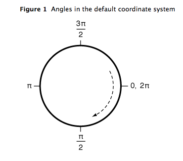
this screenshot I grab from official Apple doc doc more than 10 years ago. From that time, this is one of the most helpful image related to drawing in the iOS system i ever had. You welcome!
Label positioning
Labels are positioned using cosine/sine calculations based on the angle of each sector - a classic polar-to-Cartesian conversion.
Step 8 — Additions
As Additions we may add some empty state (for cases when data is not available):
.chartBackground(content: { _ inWe may also make some optimisation and data edge cases check.
4. Pitfalls & Lessons Learned
- Chart Overlay Coordinate System – always use
proxy.plotSizefor alignment. - Animation Conflicts – animate array changes manually.
- Floating-Point Angle Accumulation – maintain consistent degree-per-sector logic.
- Nested GeometryReader – scale all inner views using a local container dimension.
- Async Animation Timing – use small delays to prevent glitchy first frames.
5. Conclusions
This approach shows SwiftUI’s power when combining SectorMark, overlays, custom shapes, and carefully managed animation and geometry.
Resources
Share on: