Onboarding animation
swift animation RunLoop SwiftUI pageControl Estimated reading time: 6 minutesIn my previous article, I wrote about additional animation and showed a few cases of how the app can be improved. Thus I love animations,
I try to use it a lot. In this article, I would like to show how we can do fluid page indicator with progress using SwiftUI.
Of cause - understand from the name what I mean it’s quite hard because name selection it’s a hard topic and sometimes I spend hours to find out a good name (rare cases but it happens)
Here is a small demo:

problem
Why do I need such a kind of UI element? On design for onboarding flow Customer want to have auto-scroll with certain intervals and visual feedback for it. At the same moment, onboarding should be controlled with any manual actions, that can interrupt the process.
To solve this, as in most cases, I used the divide and conquer strategy.
We can split easily task into smaller chunks and solve them one by one, combining results from them will lead to a solved task.
solution
content
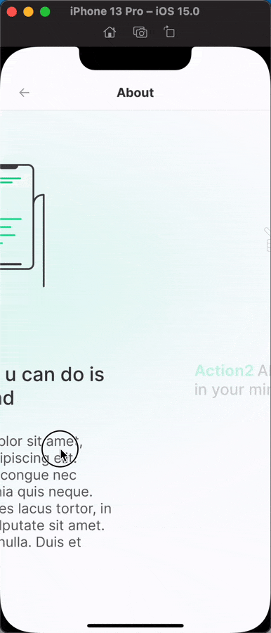
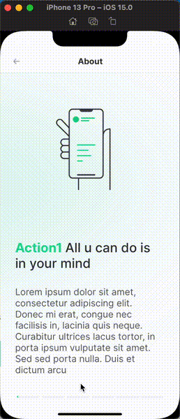
Of cause for onboarding, we have some views that can be scrolled. This view contains some info. This isn’t a problem - we can just use TabView with .page style:
 TabView(
      selection: viewStore.binding(
        get: \.selectedItemPage,
        send: MoreInfoAction.onItemSelection
      ),
      content: {
        ForEach(0..<viewStore.pages.count) { idx in
          MoreInfoPageView(
            data: viewStore.state.pages[idx],
            animate: viewStore.selectedItemPage == idx
          )
        }
      })
      .tabViewStyle(PageTabViewStyle(indexDisplayMode: .never))
PageTabViewStyle(indexDisplayMode: .never)makes sure that we hide default indicator of theUIPageViewController
To make things a bit interesting, we can add some simple effects to each page, that will be triggered on page selection:
MoreInfoPageView(
		data: viewStore.state.pages[idx],
		animate: viewStore.selectedItemPage == idx
	)
	.tag(idx)
	.opacity(idx == viewStore.selectedItemPage ? 1 : 0.2)
	.scaleEffect(idx == viewStore.selectedItemPage ? 1 : 0.8)
	.animation(.linear)
This code will make our content appears from a hidden state with some nice scale effect.
I use TCA architecture, so viewStore - it’s just a component from this architecture that contains a few layers for proper work of view and data isolation. Visit the link above for more.
In your case u can just use
@State var selectedItemPageandviewStore.bindingequivalent to$selectedItemPage. Thus TCA is not the main topic of this article, I skip any explanation related to this.
The result:
page indicator
interface
Creating UI for pageIndicator using SwiftUI is an easy task - we can use Capsule (or a few of them) and mask, which will change according to progress. This will make an effect on the progressive changes.
We need 2 layers of the same structure - one for showing inactive state - another to show already completed state.
The code for this could be like this:
HStack(spacing: 0) {
  Spacer()
    .frame(width: 4)
  ForEach(0..<viewModel.elementsCount) { _ in
    Capsule()
      .foregroundColor(self.backgroundColor)
      .frame(height: 5)
    Spacer()
      .frame(width: 4)
  }
}
.overlay(
  HStack(spacing: 0) {
    Spacer()
      .frame(width: 4)
    ForEach(0..<viewModel.elementsCount) { _ in
      Capsule()
        .foregroundColor(self.foregroundColor)
        .frame(height: 5)
      Spacer()
        .frame(width: 4)
    }
  }
	.mask(
	  GeometryReader { proxy in
	  Rectangle()
	      .frame(width: proxy.size.width * viewModel.currentProgress)
	  }
	)
)
logic
Now the most interesting part - page indicator with progress. How it can be done? we can of cause think about various GeometryEffects and other stuff like this, but we also have user interaction.
If u interested in
GeometryEffects- check this post
Here is good to know how user events are handled in iOS, how RunLoop works. Knowing that we can use this information to properly configure scrollProgress propagation.
I wrote an article about
RunLoopif u would like to read more about it.
So, the idea - is to create progress propagation that depends on timePerPage and allow a user to manually scroll the tutorial, storing progress into currentIndex.
currentIndex can be easily obtained from tabView or calculated based on offset and pageWidth (here GeometryReader can help a lot).
Propagation can be done using Timer. We should use .default mode for RunLoop instead of .common pseudo-mode. This will auto stop timer on any user activities such as scroll - exactly what we need here.
Timer.publish(every: tick, tolerance: tick, on: .main, in: .default)On every tick we should update progress and selected page:
  self.timePassed += tick
  if self.timePassed > self.totalDuration {
    self.timePassed = 0
  }

  self.currentProgress = self.timePassed / self.totalDuration
  self.currentIndex = Int(self.currentProgress / self.progressPerItem)
Our view with progress indicator will listen to changes from the progress propagator and user interaction. We can use @Binding here to make propagation between all 3 components even more easier (here is an example of the power of SwiftUI and Combine).
I wrote an article about
Bindingif u want to know more.
result
Putting this all together we can now add our components to the TabView as an overlay:
.overlay(
        FluidProgressView(
          foregroundColor: Color.App.Green.value_700,
          backgroundColor: Color.App.Gray.value_200,
          elementsCount: viewStore.pages.count,
          timePerItem: 4,
          selectedIndex: viewStore.binding(
            get: \.selectedItemPage,
            send: MoreInfoAction.onItemSelection
          )
        )
          .padding(.horizontal, 32),
        alignment: .bottom
      )
I gave it the name
FluidProgressView- because it moves as a fluid in the tube. and show the progress of action :]
The full code of FluidProgressView
import Combine
import SwiftUI

public struct FluidProgressView: View {

  final private class FluidProgressViewModel: ObservableObject {

    @Published var currentProgress: CGFloat = 0
    @Published var currentIndex: Int = 0

    fileprivate let elementsCount: Int
    fileprivate let timePerItem: TimeInterval
    fileprivate let totalDuration: TimeInterval
    fileprivate var timePassed: TimeInterval = 0
    fileprivate let progressPerItem: TimeInterval
    private var token: AnyCancellable?

    // MARK: - Lifecycle

    init(
      elementsCount: Int,
      timePerItem: TimeInterval
    ) {
      self.elementsCount = elementsCount
      self.timePerItem = timePerItem
      self.totalDuration = timePerItem * Double(elementsCount)
      self.progressPerItem = 1.0 / Double(elementsCount)
    }

    // MARK: - Internal

    func start() {
      token?.cancel()

      let tick: TimeInterval = 0.01
      token = Timer.publish(every: tick, tolerance: tick, on: .main, in: .default)
        .autoconnect()
        .sink { _ in
          self.timePassed += tick
          if self.timePassed > self.totalDuration {
            self.timePassed = 0
          }

          self.currentProgress = self.timePassed / self.totalDuration
          self.currentIndex = Int(self.currentProgress / self.progressPerItem)
        }
    }

    func stop() {
      token?.cancel()
      token = nil
    }

    func updateIndexTo(_ index: Int) {
      stop()

      timePassed = timePerItem * Double(index)
      currentProgress = progressPerItem * Double(index)
      currentIndex = index

      start()
    }
  }

  private let foregroundColor: Color
  private let backgroundColor: Color
  @Binding private var selectedIndex: Int
  @StateObject private var viewModel: FluidProgressViewModel

  // MARK: - Lifecycle

  init(
    foregroundColor: Color,
    backgroundColor: Color,
    elementsCount: Int,
    timePerItem: TimeInterval,
    selectedIndex: Binding<Int>
  ) {
    self.foregroundColor = foregroundColor
    self.backgroundColor = backgroundColor
    self._selectedIndex = selectedIndex
    self._viewModel = StateObject(
      wrappedValue: FluidProgressViewModel(
        elementsCount: elementsCount,
        timePerItem: timePerItem
      )
    )
  }

  public var body: some View {
    HStack(spacing: 0) {
      Spacer()
        .frame(width: 4)
      ForEach(0..<viewModel.elementsCount) { _ in
        Capsule()
          .foregroundColor(self.backgroundColor)
          .frame(height: 5)
        Spacer()
          .frame(width: 4)
      }
    }
    .overlay(
      HStack(spacing: 0) {
        Spacer()
          .frame(width: 4)
        ForEach(0..<viewModel.elementsCount) { _ in
          Capsule()
            .foregroundColor(self.foregroundColor)
            .frame(height: 5)
          Spacer()
            .frame(width: 4)
        }
      }
        .mask(
          GeometryReader { proxy in
          Rectangle()
              .frame(width: proxy.size.width * viewModel.currentProgress)
          }
        )
    )
    .onAppear {
      viewModel.start()
    }
    .onChange(of: viewModel.currentIndex) { index in
      withAnimation {
        self.selectedIndex = index
      }
    }
    .onChange(of: selectedIndex) { index in
      if self.viewModel.currentIndex != index {
        self.viewModel.updateIndexTo(index)
      }
    }
  }
}
demo
Here is the result:
Resources
Share on: