Custom SegmentControl in SwiftUI
iOS SwiftUI customComponent tutorial Estimated reading time: 9 minutesMaking a great UI and UX often requires making something unique and nice. This almost always requires us, as developers, in such cases to create a custom component.
For me, this is one of the most interesting parts of the development (more interesting is just fixing a strange bug ;]).
In this post I would like to tell u how to build a custom UI component for iOS with SwiftUI - TabSegmentControlView.
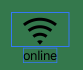
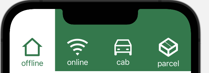
the problem
Need to create segment control with a nice selected part that looks like the next:

Using SwiftUI is much simpler than it looks at first look.
solution
As always - it’s better to decompose the task into small pieces and do it one by one.
We need a few things from this controller:
1). we want to receive some feedback about the selection
2). we want to pass into component a set of items to be shown as tabs
3). we want to configure the appearance of this component - like tintColor and other
Well, this dictates the init for our control.
For point 1 we can just use the @Binding value
@Binding private var selection: IntIf u wondering about all these propertyWrappers that are used in SwiftUI - check my post about them available here.
With point 2 - all a bit more complicated, but just a bit: let’s create a simple structure that can hold our information about the content on each tab:
public struct ElementData {
	let title: String
	let imageName: String
}
Now, let’s think about this component a bit - we are going to create the needed interface for it.
And last, but not least point - we need to send inside our control theme stuff - for now it’s just a color of background and selection:
private let tintColor: Color
private let selectionColor: Color
As result - we can receive this:
public struct TabSegmentControlView: View {
  public struct ElementData {
    let title: String
    let imageName: String
  }

  @Binding private var selection: Int
  private let items: [ElementData]
  private let tintColor: Color
  private let selectionColor: Color

  public init(
    items: [ElementData],
    tintColor: Color,
    pickerColor: Color,
    selection: Binding<Int>
  ) {
  // init props
  ...
Now, let’s prepare the next piece - view for tab. We have already defined this element data structure. What we need - is to show some text and title. We could create a separate View for this or just a function that creates a similar view inside our component. I decided to go with function - because I don’t think this view can be reused anywhere.
In general, this view will be just a vertical stack with elements:
VStack(spacing: 1) {
  Image(items[index].imageName)
  Text(items[index].title)
}
some spacing and padding can be added to adjust the appearance
We also need to think about the selected state. For this - we can just compare selection == index where selection is our @Binding and index - input to function that builds element:
func segmentItemView(for index: Int) -> some View {

// and on elements that must change tint:

.foregroundColor(selection == index ? tintColor : selectionColor)
One moment here - we need to handle somehow tap of the user - for this purpose, we can use tapGesture:
.onTapGesture { // action }The tricky moment here is that tap is accepted by content shape - where the actual content is shown. To override and extend this area we can use an additional modifier:
extension View {
  func increaseTapArea() -> some View {
    self.contentShape(Rectangle())
  }
}
full code for element
  private func segmentItemView(for index: Int) -> some View {
    VStack {
      Spacer(minLength: 4)
      HStack {
        Spacer(minLength: 0)
        VStack(spacing: 1) {
          Image(items[index].imageName)
            .renderingMode(.template)
            .foregroundColor(selection == index ? tintColor : selectionColor)
            .padding(.horizontal, 16)
            .padding(.top, 8)
            .padding(.bottom, 3)
          Text(items[index].title)
            .foregroundColor(tintColor)
            .opacity(selection == index ? 1 : 0 )
        }
        Spacer(minLength: 4)
      }
      Spacer(minLength: 0)
    }
    .increaseTapArea()
    .onTapGesture {
    	self.selection = index
    }
  }
Now, we can put all the elements in the panel in one row and add some alignment:
VStack(alignment: .center, spacing: 0) {
  VStack(alignment: .leading, spacing: 0) {
    HStack {
      ForEach(0 ..< items.count, id: \.self) { index in
        segmentItemView(for: index)
          .frame(
            height: 87
          )
      }
    }
  }
}
.background(tintColor)
The result:
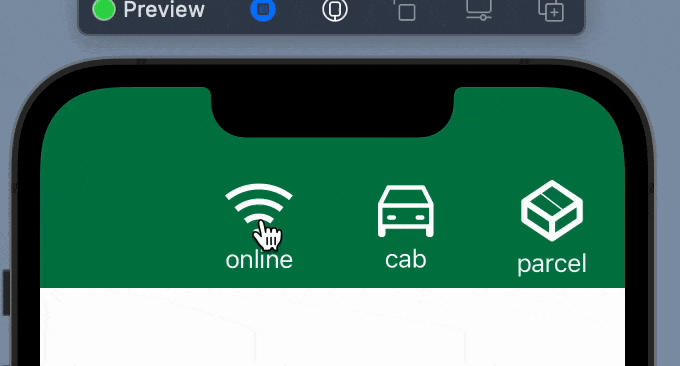
As u can see we have a few issues here - animation is not a good one. To resolve this we need just add the .animation viewModifier to an image.
With text all a bit more tricky - u cannot animate font color, instead, we can use a small workaround - put 2 Text objects one at another and animate its opacity:
  ZStack {
    Text(items[index].title)
      .foregroundColor(tintColor)
      .opacity(selection == index ? 1 : 0 )

    Text(items[index].title)
      .foregroundColor(selectionColor)
      .opacity(selection == index ? 0 : 1)
  }
  .animation(.default, value: selection)
Result - a better transition:
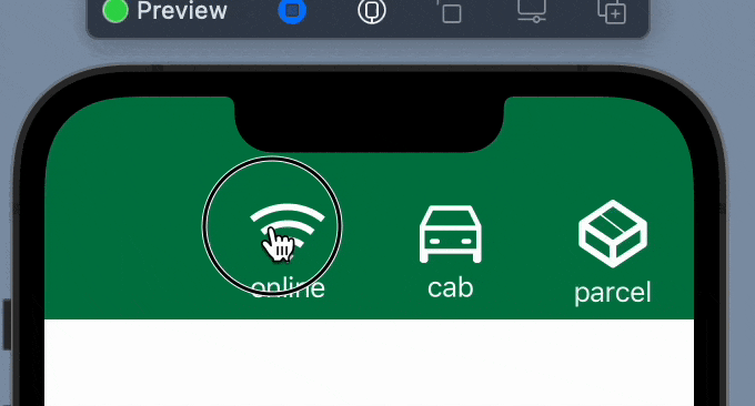
Now, we need to add a selection indicator. The easy way to do that - is to add background and animate its position on selection.
We can start with a simple rect:
.background(
  HStack {
    Rectangle()
      .fill(.white)
    Spacer(minLength: 0)
  }
)
The result:
Good, now we need to determine the width of the screen. To do so, we can use GeometryReader.
Read more about
GeometryReaderin my post here
But to be able to not use multiply GeometryReader we can use a trick with ZStack and color and store value into property:
    ZStack {
      GeometryReader { geometry in
        Color.clear
          .onAppear {
            segmentSize = geometry.size
          }
      }
      .frame(maxWidth: .infinity, maxHeight: 1)

// later use to calculate the size of the element

  private var selectedItemWidth: CGFloat {
    segmentSize.width / CGFloat(items.count)
  }

// and add it to the selector
	.frame(width: selectedItemWidth)
Result:
But when we want to interact - the selector is not moving:
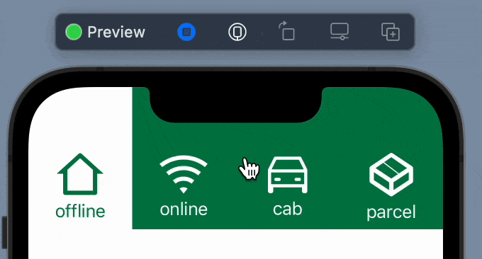
To solve this - we need to calculate the offset for the selected element and animate its change:
// calculate current offset
func selectedItemHorizontalOffset() -> CGFLoat {
  CGFloat(selection) * selectedItemWidth
}

// modify selector
.offset(x: selectedItemHorizontalOffset(), y: 0)
.animation(.linear(duration: 0.3), value: selection)
Result:

Great - the last part, is to define the selector to be in the same shape as it’s drawn in the design.
To achieve this, we can use the Shape protocol from SwiftUI. This is a protocol that accepts paths for some figures. After, we can use it as any View.
I won’t cover how to build the path, instead, if u interested - below is the full code for that.
custom shape
struct SegmentSelectionShape: Shape {
  func path(in rect: CGRect) -> Path {

    let targetRectSideOffset = rect.width * 0.45
    let newRect: CGRect = .init(
      origin: .init(
        x: rect.origin.x - targetRectSideOffset,
        y: rect.origin.y
      ),
      size: .init(
        width: rect.width + targetRectSideOffset * 2,
        height: rect.height)
    )

    var path = Path()
    path.move(to: .init(x: newRect.origin.x, y: newRect.maxY))
    path.addArc(
      center: .init(
        x: newRect.origin.x,
        y: newRect.maxY-targetRectSideOffset
      ),
      radius: targetRectSideOffset,
      startAngle: .radians(.pi/2),
      endAngle: .radians(0),
      clockwise: true
    )
    path.addLine(
      to: .init(
        x: 0,
        y: newRect.maxY-targetRectSideOffset*2
      )
    )

    path.addArc(
      center: .init(
        x: targetRectSideOffset,
        y: targetRectSideOffset
      ),
      radius: targetRectSideOffset,
      startAngle: .radians(.pi),
      endAngle: .radians(3.0 * .pi/2),
      clockwise: false
    )

    path.addLine(
      to: .init(
        x: newRect.maxX - targetRectSideOffset * 2,
        y: 0
      )
    )

    path.addArc(
      center: .init(
        x: newRect.maxX - targetRectSideOffset * 2,
        y: targetRectSideOffset
      ),
      radius: targetRectSideOffset,
      startAngle: .radians(3.0 * .pi/2),
      endAngle: .radians(2.0 * .pi),
      clockwise: false
    )

    path.addLine(
      to: .init(
        x: newRect.maxX - targetRectSideOffset,
        y: newRect.maxY-targetRectSideOffset
      )
    )

    path.addArc(
      center: .init(
        x: newRect.maxX,
        y: newRect.maxY-targetRectSideOffset
      ),
      radius: targetRectSideOffset,
      startAngle: .radians(.pi),
      endAngle: .radians(.pi / 2.0),
      clockwise: true
    )

    path.addLine(to: .init(x: newRect.origin.x, y: newRect.maxY))

    return path
  }
}
Now, when we have a shape defined - let’s replace Rectangle with our SegmentSelectionShape.
Result with adding some padding to the component:
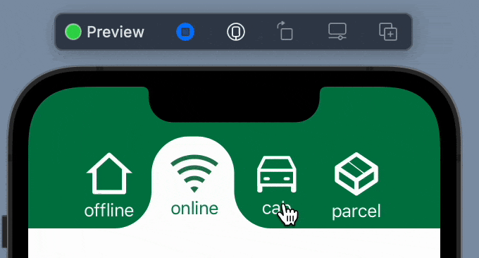
Great - this is what we exactly want to achieve.
full code for component
public struct TabSegmentControlView: View {
  public struct ElementData {
    let title: String
    let imageName: String
  }

  @Binding private var selection: Int
  @State private var segmentSize: CGSize = .zero
  @State private var itemTitleSizes: [CGSize] = []

  private let items: [ElementData]
  private let tintColor: Color
  private let selectionColor: Color

  public init(
    items: [ElementData],
    tintColor: Color,
    pickerColor: Color,
    selection: Binding<Int>
  ) {
    self._selection = selection
    self.items = Array(items)
    self.tintColor = tintColor
    self.selectionColor = pickerColor
    self._itemTitleSizes = State(initialValue: [CGSize](repeating: .zero, count: items.count)
    )
  }

  public var body: some View {
    ZStack {
      GeometryReader { geometry in
        Color.clear
          .onAppear {
            segmentSize = geometry.size
          }
      }
      .frame(maxWidth: .infinity, maxHeight: 1)

      VStack(alignment: .center, spacing: 0) {
        VStack(alignment: .leading, spacing: 0) {
          HStack {
            ForEach(0 ..< items.count, id: \.self) { index in
              segmentItemView(for: index)
                .frame(height: 87)
            }
          }
          .background(
            HStack {
              SegmentSelectionShape()
                .fill(.white)
                .frame(width: selectedItemWidth)
                .offset(x: selectedItemHorizontalOffset(), y: 0)
                .animation(.linear(duration: 0.3), value: selection)
              Spacer(minLength: 0)
            }
          )
        }
      }
    }
    .background(tintColor)
  }

  private var selectedItemWidth: CGFloat {
    segmentSize.width / CGFloat(items.count)
  }

  private func segmentItemView(for index: Int) -> some View {
    VStack {
      Spacer(minLength: 4)
      HStack {
        Spacer(minLength: 0)
        VStack(spacing: 1) {
          Image(items[index].imageName)
            .renderingMode(.template)
            .foregroundColor(selection == index ? tintColor : selectionColor)
            .animation(.default, value: selection)
            .padding(.horizontal, 16)
            .padding(.top, 8)
            .padding(.bottom, 3)

          ZStack {
            Text(items[index].title)
              .foregroundColor(tintColor)
              .opacity(selection == index ? 1 : 0 )

            Text(items[index].title)
              .foregroundColor(selectionColor)
              .opacity(selection == index ? 0 : 1)
          }
          .animation(.default, value: selection)
        }
        Spacer(minLength: 4)
      }
      Spacer(minLength: 0)
    }
    .increaseTapArea()
    .onTapGesture { onItemTap(index: index) }
  }

  private func onItemTap(index: Int) {
    guard index < self.items.count else { return }
    self.selection = index
  }

  private func selectedItemHorizontalOffset() -> CGFloat {
    CGFloat(selection) * selectedItemWidth
  }
}

extension View {
  func increaseTapArea() -> some View {
    self.contentShape(Rectangle())
  }
}

struct SegmentSelectionShape: Shape {
  func path(in rect: CGRect) -> Path {

    let targetRectSideOffset = rect.width * 0.45
    let newRect: CGRect = .init(
      origin: .init(
        x: rect.origin.x - targetRectSideOffset,
        y: rect.origin.y
      ),
      size: .init(
        width: rect.width + targetRectSideOffset * 2,
        height: rect.height)
    )

    var path = Path()
    path.move(to: .init(x: newRect.origin.x, y: newRect.maxY))
    path.addArc(
      center: .init(
        x: newRect.origin.x,
        y: newRect.maxY-targetRectSideOffset
      ),
      radius: targetRectSideOffset,
      startAngle: .radians(.pi/2),
      endAngle: .radians(0),
      clockwise: true
    )
    path.addLine(
      to: .init(
        x: 0,
        y: newRect.maxY-targetRectSideOffset*2
      )
    )

    path.addArc(
      center: .init(
        x: targetRectSideOffset,
        y: targetRectSideOffset
      ),
      radius: targetRectSideOffset,
      startAngle: .radians(.pi),
      endAngle: .radians(3.0 * .pi/2),
      clockwise: false
    )

    path.addLine(
      to: .init(
        x: newRect.maxX - targetRectSideOffset * 2,
        y: 0
      )
    )

    path.addArc(
      center: .init(
        x: newRect.maxX - targetRectSideOffset * 2,
        y: targetRectSideOffset
      ),
      radius: targetRectSideOffset,
      startAngle: .radians(3.0 * .pi/2),
      endAngle: .radians(2.0 * .pi),
      clockwise: false
    )

    path.addLine(
      to: .init(
        x: newRect.maxX - targetRectSideOffset,
        y: newRect.maxY-targetRectSideOffset
      )
    )

    path.addArc(
      center: .init(
        x: newRect.maxX,
        y: newRect.maxY-targetRectSideOffset
      ),
      radius: targetRectSideOffset,
      startAngle: .radians(.pi),
      endAngle: .radians(.pi / 2.0),
      clockwise: true
    )

    path.addLine(to: .init(x: newRect.origin.x, y: newRect.maxY))

    return path
  }
}
conclusion
Divide and conqure works everywhere. Think about something complex as about the composition of simple.
resources
Share on: